

![]()
Importing Data
This Notebook will walk you through the basic process of how to import data from Text files (.txt) and Excel files (.xls or .xlsx).
In order to complete this activity, you need to first upload your data set (e.g. Sample Data.txt or Sample Data.xlsx) into your Callysto Hub (hub.callysto.ca)
Importing a .txt file:
First, we need to import “pandas”, which is a library that contains many useful tools for working with data. Pandas is a short form for “Python Data Analysis Library”. You only need to include this line once, before the rest of your code.
import pandas as pd
Next, use the line below to read the file and assign it the variable name “dataset”. This name can be anything you choose, and can be used to refer to the data from now on.
This code assumes the columns in your data set are separated by an indented space (known as a “tab-delimited file”). If your columns are separated by commas, you will need to replace sep = “\t” with sep = “,”
dataset = pd.read_csv("data/Sample_Data.txt", sep = "\t")
Now you can simply use the variable name to display your data:
dataset
| Year | Temperature | |
|---|---|---|
| 0 | 2014 | 24.2 |
| 1 | 2015 | 25.3 |
| 2 | 2016 | 25.6 |
| 3 | 2017 | 25.8 |
| 4 | 2018 | 26.1 |
Now that our data is loaded into the notebook, we can perform simple calculations.
For example, if we wanted to find the maximum of the numbers in the second column, we do the following:
dataset["Temperature"].max()
26.1
And if we wanted to figure out the average temperature during this 5-year period, we do the following:
dataset["Temperature"].mean()
25.4
Importing an Excel spreadsheet:
Importing an Excel spreadsheet is virtually identical to importing a text file.
exceldata = pd.read_excel("data/Sample_Data.xlsx")

#Displaying the data:
exceldata
| Year | Temperature | |
|---|---|---|
| 0 | 2014 | 24.2 |
| 1 | 2015 | 25.3 |
| 2 | 2016 | 25.6 |
| 3 | 2017 | 25.8 |
| 4 | 2018 | 26.1 |
Now that the Excel file is loaded, we can perform calculations using it just like before. This time, let’s find the maximum and average values in the first column.
exceldata["Year"].max()
2018
exceldata["Year"].mean()
2016.0
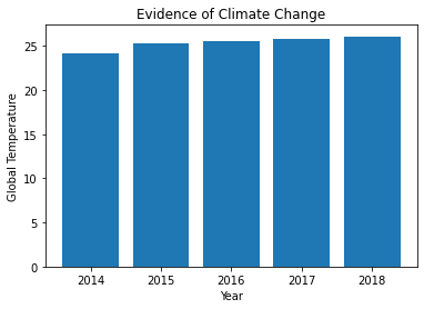
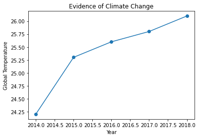
Plotting Your Data
First we’ll create a BAR graph, followed by a LINE graph. To do this, we first need to import the “matplotlib” library which enables us to create plots.
import matplotlib.pyplot as plt
plt.bar(exceldata["Year"], exceldata["Temperature"])
plt.xlabel('Year')
plt.ylabel('Global Temperature')
plt.title('Evidence of Climate Change')
plt.show()
plt.plot(exceldata["Year"], exceldata["Temperature"],marker='o')
plt.xlabel('Year')
plt.ylabel('Global Temperature')
plt.title('Evidence of Climate Change')
plt.show()
For detailed information on what you can do with the Pandas Library, check out these references.
https://pandas.pydata.org/pandas-docs/stable/
https://pandas.pydata.org/pandas-docs/stable/tutorials.html