
![]()
Plotting with matplotlib
Matplotlib is a rich collection of commands to create mathematical plots in a Jupyter notebook. It is best to search online for extensive examples.
In this notebook, we will just touch on the basics, to get you started. Read online to get many more examples and details.
Inside Matplotlib is a module called pyplot, that does most of the work for us. This is the module that will be loaded into the notebook before plotting.
It is also important to tell the notebook that you want your plots to appear “inline”, which is to say they will appear in a cell inside your notebook. The following two commands set this up for you.
%matplotlib inline
from matplotlib.pyplot import *
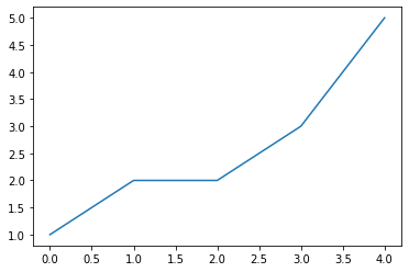
Example 1. A simple plot
We plot five data points, connecting with lines.
Note the semicolon after the plot command. It removes some extraneous message from the computer.
plot([1,2,2,3,5]);
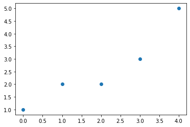
Example 2. Another simple plot
We plot five data points, marked with circles.
plot([1,2,2,3,5],'o');
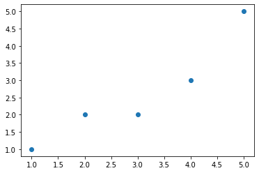
Example 3. Another simple plot, with x and y values
We plot five data points, y versus x, marked with circles.
Note the x axis now starts at coordinate x=1.
x = [1,2,3,4,5]
y = [1,2,2,3,5]
plot(x,y,'o');
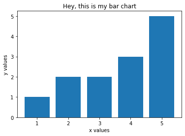
Example 4. We can also do bar plots
We plot five data points, y versus x, as a bar chart. We also will add a title and axis labels.
x = [1,2,3,4,5]
y = [1,2,2,3,5]
bar(x,y);
title("Hey, this is my bar chart");
xlabel("x values");
ylabel("y values");
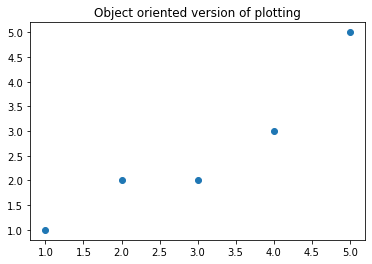
Example 5. Object oriented plotting
For more precise control of your plotting effort, you can create a figure and axis object, and modify it as necessary. Best to read up on this online, but here is the baseic example.
We plot five data points, y versus x, by attaching them to the figure or axis object, as appropriate.
fig, ax = subplots()
ax.plot([1,2,3,4,5], [1,2,2,3,5], 'o')
ax.set_title('Object oriented version of plotting');
show()
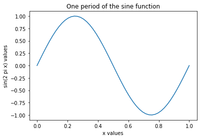
Example 6: More mathematical plotting
Matplotlib likes to work with Numpy (numerical Python), which gives us arrays and mathematical functions like sine and cosine.
We must first import the numpy module. I’ll do it in the next cell, but keep in mind you can also include it up above when we loaded in matplotlib.
We then create an array of x values, running from 0 to 1, then evaluate the sine function on those values. We then do an x,y plot of the function.
As follows:
from numpy import *
x = linspace(0,1)
y = sin(2*pi*x)
plot(x,y);
title("One period of the sine function")
xlabel("x values")
ylabel("sin(2 pi x) values");
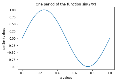
Example 7: Math notation in labels
Just for fun, we note that Latex can be used in the the plot labels, so you can make your graphs looks more profession. The key is to use the”$” delimiter to identify a section of text that is to be typeset as if in Latex.
Check out these labels:
x = linspace(0,1)
y = sin(2*pi*x)
plot(x,y);
title("One period of the function $\sin(2 \pi x)$")
xlabel("$x$ values")
ylabel("$\sin(2 \pi x)$ values");