Module 2 Unit 4 - Data Quality#
Apples to apples#

Let’s imagine we wanted to know how much physical activity students were getting outside of school hours. At the end of the month, we are faced with a pile of reports, but as we begin to go through them, we realize we have some problems.
Many are hand-written, and are practically illegible. Some contain long-form sentences about what the student did each day, some are just lists of activities with numbers of hours. Records for some days are missing, or appear to have been hastily entered all at one time. Some were recorded by the students themselves, others by a parent or guardian. Spelling mistakes are rampant.
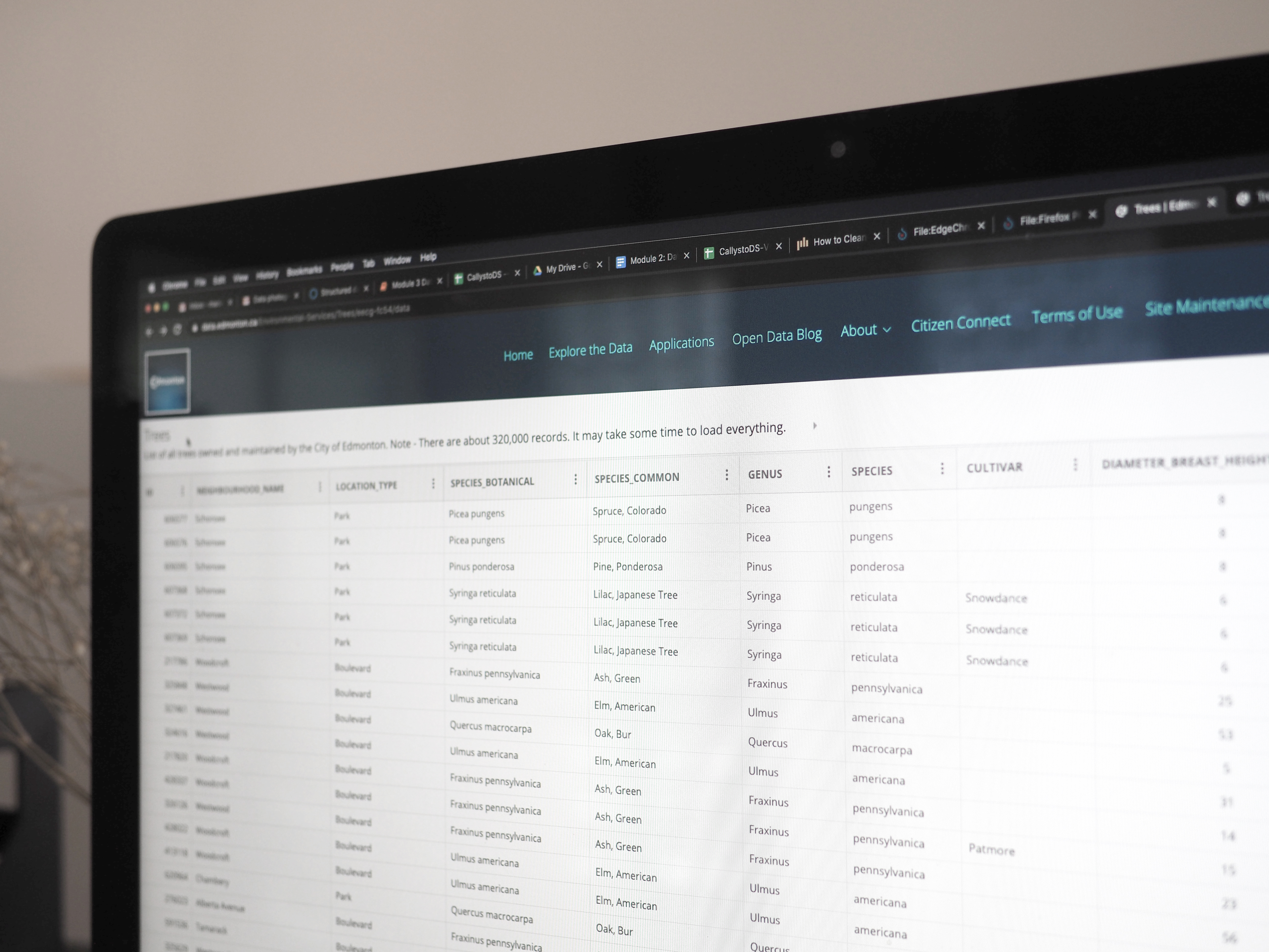
This data is unstructured, messy, inconsistent, full of errors, and missing values. In this situation, we’re not comparing apples to apples, but apples to oranges to kiwis to coconuts. And some of them are rotten.
Low quality data sets can take a lot of time to clean up enough for us to gain useful insights from them, and in some cases aren’t worth the effort. Let’s explore some different aspects of data sets that impact their quality and make them practical for data science projects.
Structured Data#
Much of the data we encounter is captured in spreadsheets. Observations are often numeric, and organized into neatly-labeled rows and columns, with some descriptive text to help aid interpretation. In other words, it is structured data.

An example of structured data is the Census by Community from the City of Calgary’s open data portal, Open Calgary.
🏁 Actvity#
Navigate to the table at the bottom of the City of Calgary Census by Community. What do you notice about this data?
Observations
In the Table Preview of the data we can see that:
The data is nicely structured (rows and columns) and less disorganized than a typical spreadsheet.
There are lots of columns.
There are cells with only text (strings), numbers, codes (mix of letters and numbers), zeroes, and blanks (missing values).

However, data can come in a wide variety of forms and doesn’t always fit nicely into a typical spreadsheet. Collections of tweets, diaries, pdf documents, videos, images, and audio files are all examples of unstructured data.
Unstructured data can be a rich source of insight, but is much more challenging to work with. Professional data scientists use specialized tools such as machine learning to help with analysis of this widely varied and complex type of data.
In this course, we focus on structured data, as it is much simpler to get started with, but teachers and students should be aware that a significant portion of the data being generated and collected today is unstructured.
Tidy Data#
Not all structured data looks the same. A single data set can be organized in a table or spreadsheet several different ways, depending on how we set up our rows and columns.
Let’s look at a few different examples. Data in the tables below is from Environment and Natural Resources Canada.
Table A
Weather Station Name |
Date |
Min Temp (°C) |
Total Snow (cm) |
|---|---|---|---|
CALGARY INTL A |
2018-12-25 |
-10 |
0.8 |
CALGARY INTL A |
2019-12-25 |
-16.1 |
0 |
VANCOUVER INTL A |
2018-12-25 |
1.1 |
0 |
VANCOUVER INTL A |
2019-12-25 |
-0.5 |
0 |
EDMONTON INTL A |
2018-12-25 |
-11.2 |
2.2 |
EDMONTON INTL A |
2019-12-25 |
-17.8 |
0 |
Table B
Weather Station Name |
Date |
Key |
Value |
|---|---|---|---|
CALGARY INTL A |
2018-12-25 |
Min Temp (°C) |
-10 |
CALGARY INTL A |
2018-12-25 |
Total Snow (cm) |
0.8 |
CALGARY INTL A |
2019-12-25 |
Min Temp (°C) |
-16.1 |
CALGARY INTL A |
2019-12-25 |
Total Snow (cm) |
0 |
VANCOUVER INTL A |
2018-12-25 |
Min Temp (°C) |
1.1 |
VANCOUVER INTL A |
2018-12-25 |
Total Snow (cm) |
0 |
VANCOUVER INTL A |
2019-12-25 |
Min Temp (°C) |
-0.5 |
VANCOUVER INTL A |
2019-12-25 |
Total Snow (cm) |
0 |
EDMONTON INTL A |
2018-12-25 |
Min Temp (°C) |
-11.2 |
EDMONTON INTL A |
2018-12-25 |
Total Snow (cm) |
2.2 |
EDMONTON INTL A |
2019-12-25 |
Min Temp (°C) |
-17.8 |
EDMONTON INTL A |
2019-12-25 |
Total Snow (cm) |
0 |
Table C/D
Weather Station Name |
2018-12-25 |
2019-12-25 |
|---|---|---|
CALGARY INTL A |
-10 |
-16.1 |
VANCOUVER INTL A |
1.1 |
-0.5 |
EDMONTON INTL A |
-11.2 |
-17.8 |
Weather Station Name |
2018-12-25 |
2019-12-25 |
|---|---|---|
CALGARY INTL A |
0.8 |
0 |
VANCOUVER INTL A |
0 |
0 |
EDMONTON INTL A |
2.2 |
0 |
Although all these tables represent the data in the same way, they are not equally easy to use.
The format preferred by data scientists is known as tidy data and is represented in Table A. You may commonly see data represented in formats similar to Tables B and C / D, however there are distinct disadvantages associated with each. For example in Table B, since temperature (Min Temp) and snow (Total Snow) are intermingled in the same column, these will need to be transformed in order to analyze each variable separately. In Table C / D, temperature and snow are represented separately. This is in part troublesome as it will require extraction of information from two tables whenever data analysis is needed.
When data is tidy:
Each observation has its own row

Each variable has its own column

Each value has its own cell

This structure allows the data to more easily be read and manipulated by automated tools like the ones we’ll be using in this course. Using a single type of data formatting makes it easier for us to learn these tools, and to combine or switch between data sets.
🏁 Activity#
Use this table to answer the following questions.
Weather Station Name |
Date |
Min Temp (°C) / Total Snow (cm) |
|---|---|---|
CALGARY INTL A |
2018-12-25 |
-10 / 0.8 |
CALGARY INTL A |
2019-12-25 |
-16.1 / 0 |
VANCOUVER INTL A |
2018-12-25 |
1.1 / 0 |
VANCOUVER INTL A |
2019-12-25 |
-0.5 / 0 |
EDMONTON INTL A |
2018-12-25 |
-11.2 / 2.2 |
EDMONTON INTL A |
2019-12-25 |
-17.8 / 0 |
Does this table contain data that is tidy?
Is the Date column an example of an observation, variable, or value?
Data wrangling#
When data is of low-quality, it becomes much harder to work with. Inaccuracies, missing entries, mixed units of measurement, and so on can have big impacts on analysis and make us less confident in the results.
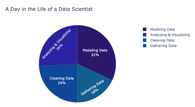
Because of this, professional data scientists spend a lot of time carefully gathering, cleaning, validating, organizing, and expanding their data sets to ensure they are as accurate and representative as possible. In many data projects, this is the stage that takes the most time.
 *Figure: Data from “2018 Machine Learning and Data Science Survey” by Kaggle licensed under CC BY-SA 4.0*
The mechanics of data wrangling is a big topic, so we won’t be exploring them in this course. Instead, we recommend using or creating data sets that are already of good quality and follow the tidy data principles.
Many of the data sets available from the open data sources we’ve already looked at have been published according to open data standards for the organization that created them, and have already been through some cleaning and structuring.
Evaluating data quality#
Teachers and students who are new to data science should look at the following elements in their data sets to ensure they are of good quality and will be suitable for class projects.
Units of measurement
Variables in the data set should be measured according to the same unit across different observations. For example, if one variable is weight, there shouldn’t be a mix of imperial pounds (lb) and metric kilograms (kg) in the same data set.Unit confusion in data can have disastrous results, such as the crash of NASA’s Mars Climate Orbiter in 1999.
📚 Read#
Numerical representation
Numerical values should be represented consistently across observations and in a way that fits the variable. For example, if the variable is a count of something, such as the number of dogs in a household, all the variables should be whole integers, with no decimals.If we see that a particular household has 1.14592 dogs, that’s a pretty clear sign that there’s a problem with the observation!
Dates and times
When working with national or global data sets, time zone conversions can present a problem. A good best practice is to see if Coordinated Universal Time (UTC) time stamps have been used, rather than local time. ISO 8601 is the standard way to represent dates and times.
📚 Read#
Missing Values
It’s common for values to sometimes be missing from a data set. This can happen as a result of problems during collection, or when the data was extracted from another digital source. Missing values need to be addressed so they don’t throw off your analysis. This step is known as replacement and can mean moving the observation, replacing it with a statistical stand-in, such as the average for that variable, or a prediction of what it likely would have been based on patterns in the data.If a lot of values seem to be missing, it might be worth using a different data set to help minimize the time and effort this step takes.
📚 Read#
The tale of missing values in PythonSo far we’ve explored what data is, what kinds of questions it can answer, what good quality data looks like, and where to find it.
Now let’s take a deeper look at the tools we can use to clean, transform, and analyze it: Python code and Jupyter notebooks.
Conclusion#
So far we’ve explored what data is, what kinds of questions it can answer, what good quality data looks like, and where to find it.
Now let’s take a deeper look at the tools we can use to clean, transform, and analyze it: Python code and Jupyter notebooks.

