Module 5 Unit 2 - Identifying Trends in Data#

Humans are wired to look for patterns of cause and effect in the world around us. These are a type of trend — an action leads to a consequence and the more effort that is applied to the action, the more pronounced the consequence becomes.
For example, a student might expect to have a better test score the more hours they study for the exam. Or, a runner might expect to have faster times and more endurance as they continue to train.
calculator and notepad placed on money
Mathematical expressions can help us understand the relationship between our variables. As an example, suppose you’re working in a restaurant and you discover that the more hours you work, the more tips you earn.
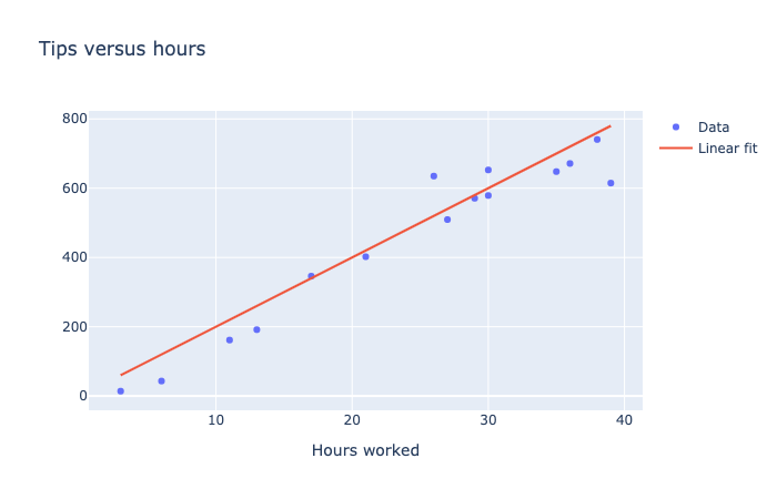
Looking at the scatter plot below, we can see that you earn roughly 20 dollars in tips for each hour worked. This is a linear trend— that data points appear to roughly follow a straight line.

A scatter plot with 15 data points showing the relationship between tips received per hours work. The data follows a nearly linear trend, ranging from zero tips for zero hours, to $800 in tips for 40 hours worked. A red line indicates the best fit linear trend to the data.
The line is a representation of the trend. The data points don’t all fall exactly on this line—some customers tip more than others, and some hours have less customers. Still, it is useful to see the approximate relationship between the hours worked and total tips earned.

However not all trends are linear. For example, suppose you’re training to be a weightlifter. Each week you train, you’re able to lift more weight. At the beginning, you might see very impressive gains in the amount of weight you can lift. However as the weeks pass, your gains begin to slow.
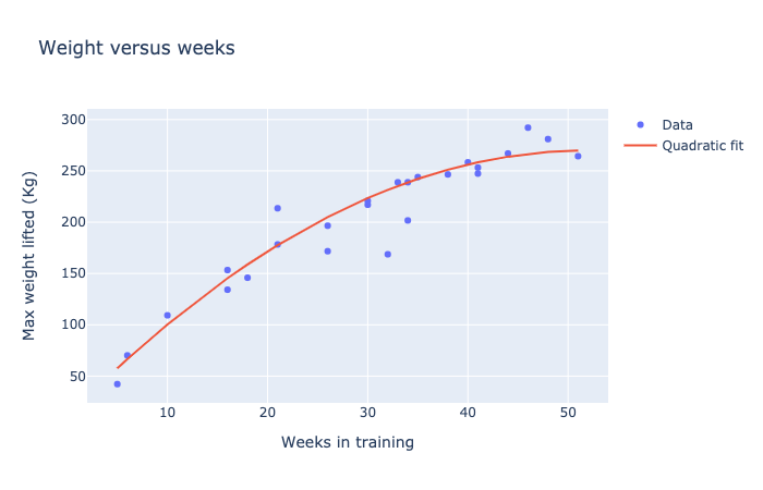
Plotting the weight lifted versus weeks trained might give you a graph like this:

A scatter plot with 25 data points showing the relationship between tips received per hours work. A red line indicates the best fit quadratic trend to the data.
In this case, a curved line seems to fit the data points better than a straight line. And the flattening out near week 50 demonstrates diminishing returns.
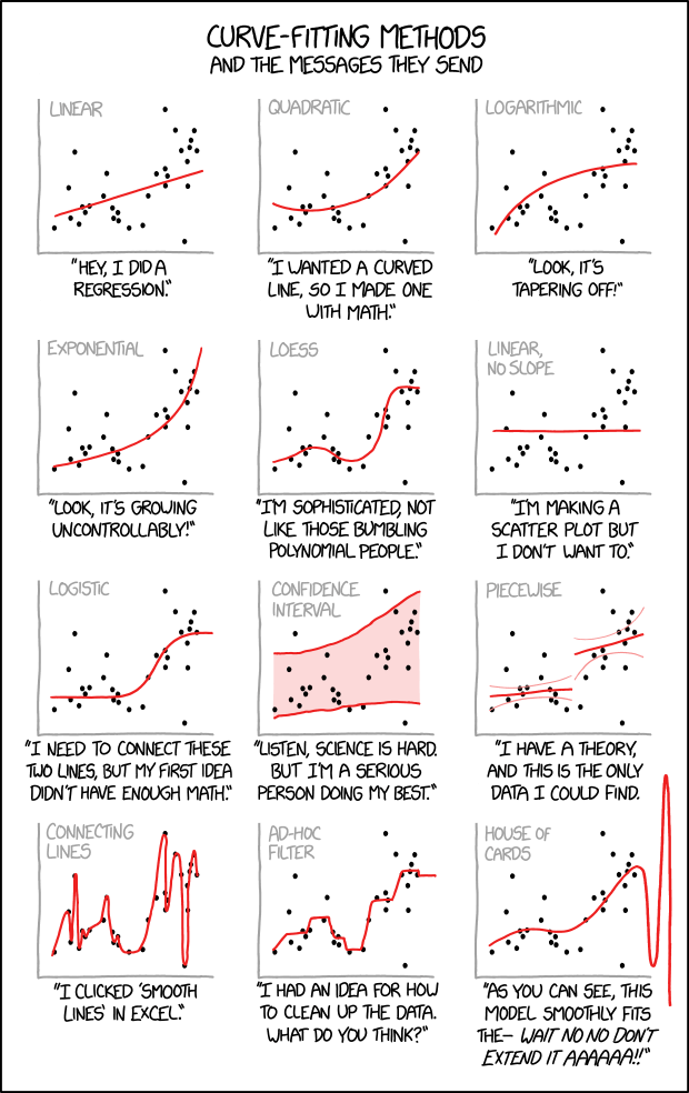
Data scientists have employed a wide variety of curves when working with data. Whether a trend line is appropriate and how it is fit depends on what kind of data you’re working with.

“Curve Fitting” by XKCD is licensed under CC BY-NC 2.5
Explore#
This notebook contains more examples on visualizations with data. Log in to the account you previously used to access the Callysto Hub. Multiple Visualizations
🏁 Activity#
Drag and Drop?

