
Module 5 Unit 6 - Critical Analysis of Software Output#
Now that we’re familiar with some tools used for working with data, let’s talk about analyzing and interpreting data. Analyzing and interpreting data is a big topic. In this course, we’re focusing on the basic descriptive analysis.
The role of data analysis and interpretation is to summarize our findings into key points of information. This helps us to understand the elements that are most relevant to our needs and to make decisions based on those elements, rather than trying to absorb and use the mass of raw data on its own.
person typing on a MacBook Pro
For instance, suppose you were interested in applying for a job at a large enterprise and were curious about typical employee salaries. If you had access to a data set of current employee salaries, this information could tell you about what kind of salary you could expect if you landed the role.
However, the data set for a large enterprise would likely contain a lot of entries. The data set could also include a wide variety of variables such as the role title, previous experience, years with the company, education, benefits package, vacation days and more.
To see trends that are relevant to your needs and interests, you would need to do some analysis. Let’s say you computed the average salary of all employees and found it was $30,000 per year. Depending on what you’re used to, this might sound like an okay starting salary. However with deeper inspection and the use of some data visualizations you could get a much more detailed idea of what to expect.
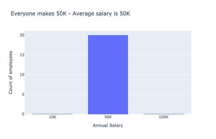
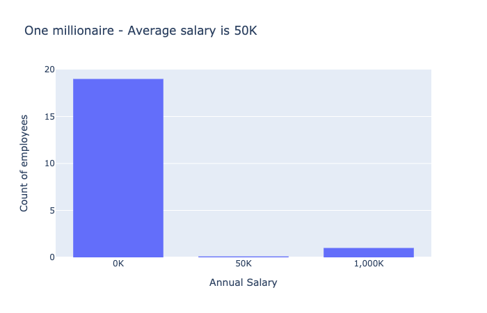
Both bar charts show the salary for employees at a company. In the first bar chart, everyone makes $50K, represented by a single bar at 50K. In the second bar chart, one bar shows 19 people making zero dollars, the other bar shows one person making a millions dollars.
We also saw that we need to be careful with correlation coefficients. The computer will always return a number between -1 and +1 when computing a correlation coefficient, but it does not tell you whether it was appropriate to compute such a number.
For instance, when we were looking at Alertness charts, even if the data followed a nice quadratic pattern, the correlation coefficient seems to indicate there was no correlation between the variables of Time since waking and Level of alertness.
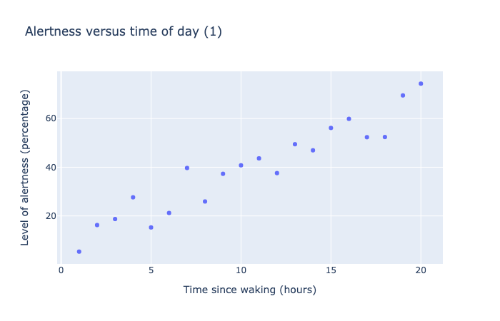
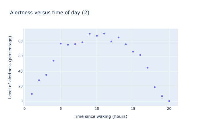
Both of these scatter charts show 20 data points measuring the level of alertness as a percentage versus time of day, as measured in hours from time of waking. The data in the first scatter chart shows a roughly linear trend, going from 0% at 0 hours to 80% at 20 hours. The data in the second scatter chart shows a parabolic trend, starting from 0% at 0 hours, rising to a maximum of 100% at 10 hours, then dropping back to 0% at 20 hours.
Correlation calculations of the above data visualizations suggest in the first plot that Level of alertness is closely correlated with Time since waking (corr = 0.95), while in the second one they are not correlated (corr = -0.17).
Yet, clearly they both show strong patterns of dependence. The issue here is the non-linearity in the second curve, which correlation coefficients don’t deal with very well.
Fitting curves to data is another place to be careful — the computer will always try its best to fit the curve you request, even if the curve is not appropriate for the data.
Suppose we tried to fit an exponential curve to our Alertness data. The code is similar to before, except we try to fit a curve of the form y = a * e^(bx).
The code for fitting the data looks like this:
def func(x,a,b):
    return a*exp(b*x)

curve_fit(func, x, y)
This code returns the best values for parameters a and b:
[59.8192, -.0084185]
This may look like a perfectly reasonable answer, but look at what happens when we plot this curve with the data points.
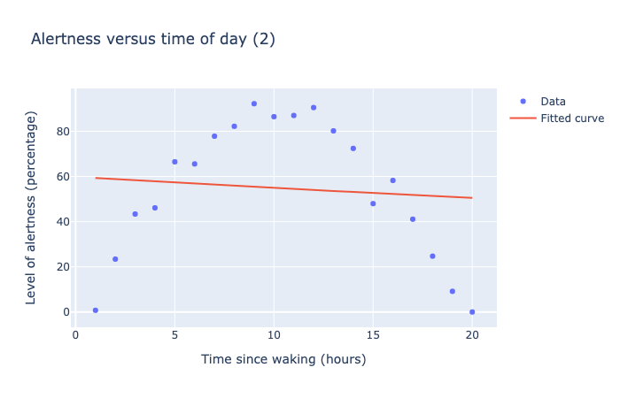
This scatter plot show 20 data points indicating alertness as a function of time. Alertness goes from 0% to 100% after 10 hours, then dropping back to 0% at 20 hours. The fitted curve looks roughly linear, and runs through the middle of the data. The curve is a very bad fit, representing the fact that this mathematical model is not approrpriate for this data.
The curve does run through the middle of the data, but it doesn’t fit very well! The problem here is that the exponential curve is a poor choice to model this data.
However, the computer doesn’t know it is a poor choice, so you need to inspect the results critically before drawing any conclusions.
📚 Read#
This short 2014 article from the Harvard Business Review demonstrates the value of looking critically at high-level summaries of data when making business decisions. When It Comes to Data, Skepticism Matters
🏁 Activity#
Do a search in your favourite online newspaper for the term “exponential growth” or “growing exponentially.”
What event is the reporter referring to as something that is growing exponentially?
Is the reporter using the term accurately — that is, is the growth really exponential?
If yes, how long does it take for the “something” to double?
What stops exponential growth, in your example above? For instance, infections due to a virus cannot grow exponentially forever, because eventually someone finds a vaccine, or we run out of new people to get sick! What is the “resource” feeding the growth that eventually runs out?
📚 Read (Optional)#
This BBC news article discusses the “exponential growth bias” and how it relates to COVID-19. {Exponential growth bias: The numerical error behind Covid-19}(https://www.bbc.com/future/article/20200812-exponential-growth-bias-the-numerical-error-behind-covid-19)
You Made it!!#

This marks the end of instructional content for Callysto’s Data Science course.
At a high level, we’ve covered what data science is, why it’s valuable, and how to get started doing your own data science projects in the classroom and out in the wider world. We’ve looked at different ways to analyse, interpret, and communicate information about data, as well as how to avoid some common pitfalls and tell when data is being used to mislead us.
Now it’s time to put it all together. In the final section of the course, you’ll create your own data science project using real data in a Jupyter notebook.
You can use your Jupyter notebook in the classroom to demonstrate data science or programming concepts. We’ve also included instructions on how to share your project with Callysto or with colleagues.
Resources for further reading (Optional)#
Statistics:
How to Lie with Statistics. Darrell Huff. W. W. Norton & Company. 1982.
How to lie with statistics: physics.smu.edu/pseudo/LieStat
More on how to lie with statistics: towardsdatascience.com/lessons-from-how-to-lie-with-statistics-57060c0d2f19
Data Science:
Computational and Inferential Thinking: The Foundations of Data Science. Ani Adhikari and John DeNero. U.C. Berkeley. CC BY-NC-ND 4.0. 2020.
Jo Boaler’s youcubed K-12 Data Science literacy resources: youcubed.org/resource/data-literacy
Tutorials on data science in Python: realpython.com/tutorials/data-science
Blog on learning data science in Python: dataquest.io/blog/how-to-learn-python-for-data-science-in-5-steps
Code Academy / Data Science codecademy.com/learn/paths/data-science
Data Camp: datacamp.com/community/blog Ten best blogs: tableau.com/learn/articles/data-science-blogs
References#
Books:
Python for Data Analysis. Wes McKinney. O’Reilly Media. 2017.
Factfulness. Hans Rosling. Flatiron Books. 2018.
