Module 5 Unit 1 - Introduction#

Now that we’re familiar with some tools used for working with data, let’s talk about analyzing and interpreting data. Analyzing and interpreting data is a big topic. In this course, we’re focusing on the basic descriptive analysis.
The role of data analysis and interpretation is to summarize our findings into key points of information. This helps us to understand the elements that are most relevant to our needs and to make decisions based on those elements, rather than trying to absorb and use the mass of raw data on its own.
person typing on a MacBook Pro
For instance, suppose you were interested in applying for a job at a large enterprise and were curious about typical employee salaries. If you had access to a data set of current employee salaries, this information could tell you about what kind of salary you could expect if you landed the role.
However, the data set for a large enterprise would likely contain a lot of entries. The data set could also include a wide variety of variables such as the role title, previous experience, years with the company, education, benefits package, vacation days and more.
To see trends that are relevant to your needs and interests, you would need to do some analysis. Let’s say you computed the average salary of all employees and found it was $30,000 per year. Depending on what you’re used to, this might sound like an okay starting salary. However with deeper inspection and the use of some data visualizations you could get a much more detailed idea of what to expect.
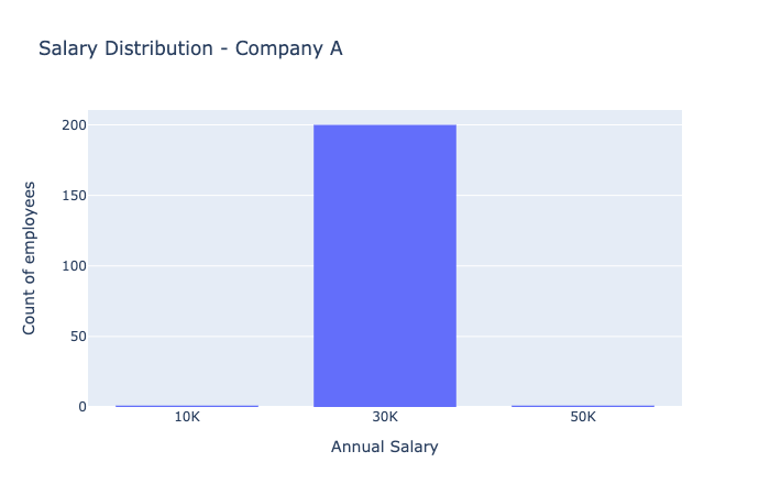
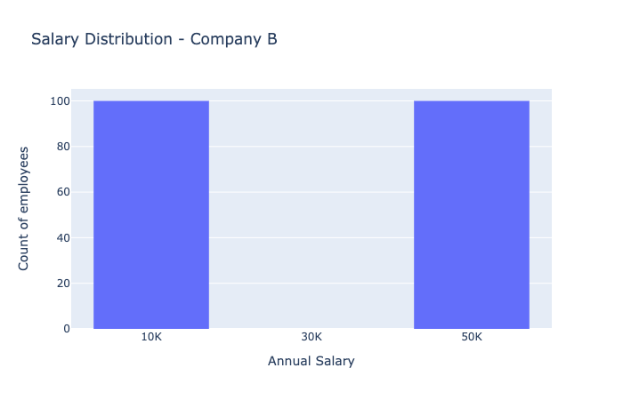
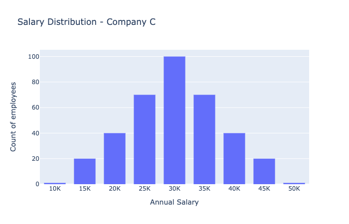
As an example, consider these three histograms for salaries at three different companies:

A bar chart showing salary distribution in Company A. The three bars show very few employees at \(10K, very few at \)50K, and the vast majority at a salary of $30K.

A bar chart showing salary distribution in Company A. The three bars show very few employees at \(30K, most are at either \)10K or $50K.

A bar chart showing salary distribution in Company A. The salaries form normally distributed bell curve, with the centre at \(30K, with range from \)10K to $50K.
In Company A, we see most people earn $30,000 per year. This means you pretty much know what you’ll earn if you work at Company A.
In Company B, half the people make \(10,000 per year and the other half make \)50,000 per year. The average salary is still $30,000 per year for Company B. However, you might worry about taking a job there if you could end up in the low salary category.
In Company C, there is a distribution of salaries — from \(10,000 per year to \)50,000 per year. Although you might start with a lower salary, there appears to be room for salary advancement in Company C.
Different kinds of analysis can give us different ways to summarize about our data sets.
Statistical analysis
Statistical analysis lets us extract specific numbers that summarize important information about a data set. This can include the average, the spread or range, the maximum and minimum, and so on.
Cluster analysis
Cluster analysis helps us identify natural groupings of sample points in a data set. For instance, in Company B, a cluster analysis might reveal that particular types of roles — such as managers — make the higher salaries while everyone else has significantly lower salaries.
Trend analysis
Trend analysis helps us to identify trends in the data. For instance, in Company C we might discover that higher salaries are correlated with more years of experience in that role.
Reflection#
Imagine you had access to a data set of salary information about a company you wanted to work for.
Think of some reasons why different people at the same company might make different salaries. Are there ways you could use statistical, cluster, or trend analysis to see if those hypotheses are playing out in the data the way you would expect?
Are some of those reasons unfair? What patterns might you expect in a salary data set in a company that does not pay their employees in a way you agree with?

