
Module 4 Unit 4 - Python Libraries for Data Visualizations#
Get the most out of this section by opening a Jupyter notebook in another window and following along. Code snippets provided in the course can be pasted directly into your Jupyter notebook. Review Module 2, Unit 5 for a refresher on creating and opening Jupyter notebooks in Callysto.
Libraries are collections of code for performing different kinds of tasks. Programmers can install libraries developed by others to allow them to easily do different things without having to reinvent methods on their own.
The Python developer community is full of experienced programmers who have made their code available to be used.
Let’s explore some key libraries that are useful when creating data visualizations.
Matplotlib
Plotly
Cufflinks
Folium
The examples in this unit use a real data set sourced from Vancouver Open Data.
Run the code below in a Jupyter notebook to pull the Public Art data set and follow along.
# Get data from URL
import requests as r
import pandas as pd


# Get data
link = "https://tinyurl.com/ycjwdfhk"
API_response_trees = r.get(link)
data = API_response_trees.json()
# Parse data
records = pd.json_normalize(data=data['records'])

# Append coordinates
lon = [ ]
lat = [ ]
for item in records['fields.geom.coordinates'].to_list():
    if type(item) !=float:
        lon.append(item[0])
        lat.append(item[1])
    else:
        lon.append(0)
        lat.append(0)

records['longitude'] = lon
records['latitude'] = lat

display(records.head())
The output should look like this:

This is a dataset that contains complete information on art in Vancouver. We see the ID of art, the artist project statement, number of artists that worked on it, the neighborhood where it was installed, its coordinates and the type of datapoint.
Matplotlib#
The Matplotlib library provides methods for creating a variety of different kinds of data visualizations, including static, animated, and even interactive visualizations.
Pyplot is a submodule of Matplotlib. Using the Pyplot module allows us to plot data stored in lists and arrays.
🏁 Activity: Creating simple charts with Pyplot#
Step 1
We can access a submodule within a library with an import command that specifies the library name, followed by a dot (.) and the submodule name.
Run the code below to import Pyplot.
import matplotlib.pyplot as pltimport matplotlib.pyplot as plt
With this command, we’ve also given pylot an alias, plt, so we don’t have to type out matplotlib.pyplot every single time we want to use a function from it.
Instead, all functions associated with this class can be accessed with the syntax plt.FunctionName.
Step 2
Let’s take a closer look at the different statuses of the art in our data set, and see how many pieces of art are in each status.
grouped_by_status = records.groupby("fields.status").size().reset_index(name="Count")
grouped_by_status
The output should look like this:
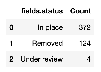
This is a dataframe contaning information on the status of art, where art can either be “In place”, “Removed” or “Under review”. On the first row (index 0), we see there are 372 pieces of art that are in place. On the second row (index 1), we see that 124 pieces of art have been removed. On the third row (index 2), we see that 4 pieces of art are under review.
Step 3
Now that this data is broken out, we can create charts from it.
Run the code to create a bar chart.
# create a bar chart
plt.bar(grouped_by_status["fields.status"],grouped_by_status["Count"]);

# add title, x and y labels (respectively)
plt.title("Status of Art");
plt.xlabel("Status");
plt.ylabel("Count");
plt.show()
The output should look like this:
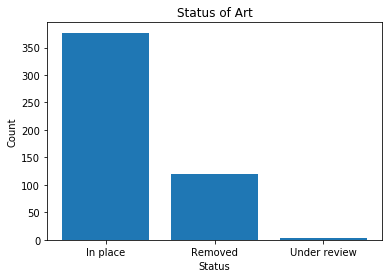
In this chart, over 350 pieces of art are in place, over 100 have been removed, and less than 10 are under review.
Now create a pie chart.
# create a pie chartlabels = grouped_by_status["fields.status"]
patches, texts = plt.pie(grouped_by_status["Count"], startangle=90)
plt.legend(patches, labels, loc="best")
plt.title("Status of Art")
plt.show()
The output should look like this:
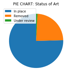
This chart indicates the proportion of the status for each piece of art. We see that over three quarters of all art pieces are in place, less than one quarter have been removed, and a very small proportion are under review.
Explore#
This site contains in-depth guides for using Matplotlib, and is broken down into beginner, intermediate, and advanced sections, as well as sections covering specific topics. Tutorials — Matplotlib documentation
Plotly#
The Plotly graphing library is developed by Plotly, a tech company from Montréal. The library provides online graphing, analytics, and statistics tools for individuals and collaboration and is both free and open source, despite being created by a private company.
Unlike Matplotlib.pyplot, Plotly allows us to create dynamic data visualizations that viewers can interact with. Plotly is also designed to work easily with DataFrames, allowing us to use DataFrame names and column names as parameters.
Let’s use one of the Plotly submodules, Plotly Express, to create some simple visualizations of the Public Art data set we looked at earlier. Go to the start of this unit and run the provided code if you need to pull in the data set again.
Run the code below to import the express class within the Plotly library and assign it the alias px.
import plotly.express as px
Try creating a bar chart of the types of artwork in our data set with the bar function.
px.bar(records,"fields.status",title="Bar chart: status of art")
Status of Art?
Now let’s create a slightly different type of bar chart, this time of the neighbourhoods in our data set with the histogram function.
px.histogram(records,x="fields.neighbourhood",title="Histogram, art per neighborhood")
Histogram, art per neighborhood?
Now let’s create a pie chart of the different types of public art in our data set.
px.pie(records,"fields.type",title="Pie chart: type of art")
Pie chart: type of art?
We can also integrate different kinds of visualizations into one presentation.
px.scatter(records,"fields.neighbourhood",
           "fields.type",marginal_y="box", marginal_x="histogram",
           color="fields.status",
           title="Scatter plot (main plot) of type of art vs neighborhood. Bar chart (top), box plot (right)")
Scatter plot art vs neighborhood ?
Explore#
Plotly Python Open Source Graphing Library Fundamentals contains tutorials and tips about fundamental features of Plotly’s python API.
🏁 Activity#
Try updating the code for our Plotly data visualizations to show different variables from our data set, such as:
fields.artists
fields.neighbourhood
fields.ownership
fields.primarymaterial
fields.yearofinstallation
fields.neighbourhood
px.pie(records,”fields.neighbourhood”,title=”Pie chart: art by neighbourhood”)
fields.ownership
px.histogram(records,x=”fields.ownership”,title=”Histogram, public art ownership”)
fields.primarymaterial
px.histogram(records,x="fields.primarymaterial",title="Histogram, primary material of the art")
*Notice how “bronze” and “Bronze” are separate items. Unless we standardize the spelling in the data, Plotly will treat these as items as distinct. *
fields.yearofinstallation
px.histogram(records,x="fields.yearofinstallation",title="Histogram, years of art installation")
px.bar(records,'fields.yearofinstallation',title="Bar chart: year of art installation")
Notice how the histogram plot will combine counts from ‘yearofinstallation’ into groups of years (e.g. 4 year intervals) while the bar plot will plot counts for each year.
Cufflinks#
Cufflinks connects pandas to Plotly to help us produce data visualizations from DataFrames more easily.
Normally we would need to call a library and specify the DataFrame, variables, and type of plot.
But with Cufflinks we can easily generate a line plot with the following commands:
import cufflinks as cfimport cufflinks as cf

#command to display graphics correctly in a Jupyter notebook
cf.go_offline()
pets.iplot()
Like Plotly’s Python libraries, Cufflinks is also free and open source.
iplot acts like any other pandas method, including head(), unique(), and columns - so it is adding one more tool to your toolkit!
🏁 Activity#
Try running the code below to create a bar chart and pie chart with cufflinks.
import cufflinks as cf

Type_of_field = records.groupby("fields.type").size().reset_index(name="Count")
Type_of_field.iplot(kind='bar',
                    y="Count",
                    x="fields.type",
                    title="Bar chart: Type of art",
                   xTitle="Type of art", yTitle="Count")
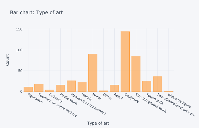
Bar showing art type and the number of art pieces categorized as such. Figurative: 10. Fountain or water feature: 15. Gateway: 3. Media work: 16. Memorial or monument: 25. Mosaic: 20. Mural:109. Other: 2. Relief: 15. Sculpture: 141. Site-integrated work: 81. Totem pole: 23. Two dimensional artwork: 36. Welcome figure: 1.
Type_of_field.iplot(kind='pie',values="Count",labels="fields.type",
                   title="Pie chart: Type of art")
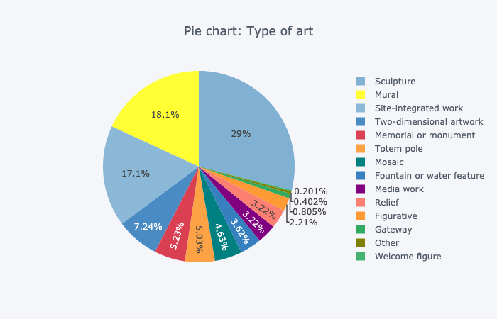
Pie chart showing art type and the percentage of art pieces categorized as such. 28% sculpture, 18% mural, 17.2% site-integrated work. 7.4% two-dimensional artwork. 5.2% memorial or monument. 5% totem pole. 4.4% mosaic. 3.6% media work. 3% relief. 3% fountain or water feature. The remaining art types make up less than 2% for each type.
📚 Read#
Folium#
Folium is a Python library that allows us to create interactive Leaflet maps, which operate in a similar way to Google Maps. These maps are attractive and user-friendly and can be generated with only latitude/longitude coordinates.
📚 Read#
🏁 Activity#
Let’s try using Folium to create an interactive map of the Vancouver area.
Run the following code to import the folium tool.
import folium
Now we’ll define the latitude and longitude of the area we want to look at.
latitude = 49.2827
longitude = -123.1207

SC_COORDINATES = [latitude, longitude]
Now we’ll define our map, which we’ll call map_osm. We tell it to use the coordinates we’ve already defined (SC_COORDINATES), how far to zoom in on those coordinates (10), and what type of map tiles to use when it is displayed.
map_osm=folium.Map(location=SC_COORDINATES, zoom_start=10, tiles='Stamen Terrain')
Finally, we display our map.
display(map_osm)
The result should look something like this:
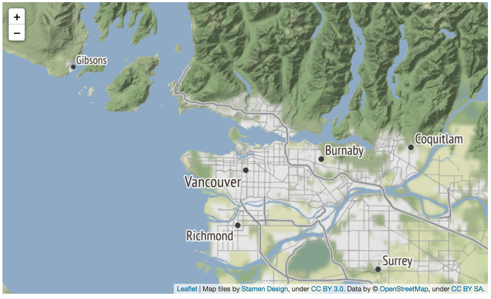
This is a geographical representation of the Lower Mainland in British Columbia, and it includes Vancouver, Richmond, Burnaby, Coquitlam and Surrey.
Folium not only allows us to generate accurate, detailed, and interactive maps but also to mark them up using information from a data set.
For example, we could pass information from our public art data set to folium and see the locations of each piece identified on the map.
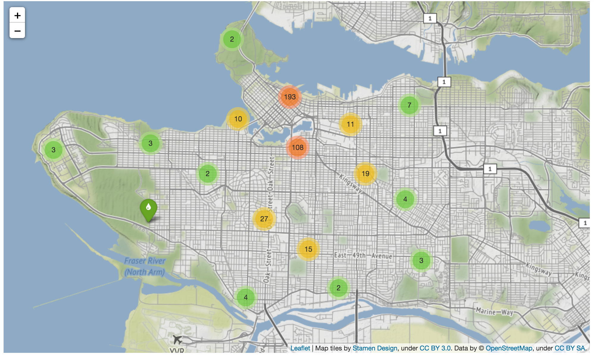
This is a geographical representation of the Lower Mainland in British Columbia, and it includes Vancouver, Richmond, Burnaby, Coquitlam and Surrey, , along with “clusters” marked in red, yellow and green where numerous pieces of art are found. Clusters in red indicate more than 100 art pieces are located nearby, yellow clusters indicate that less than 100 but more than 10 pieces of art are located nearby, and green clusters indicate that less than 10 pieces of art are located nearby. Clicking on the clusters showcases the precise location of each by zooming in on the map.
🏁 Activity#

Digital Orca, an art sculpture located in Vancouver, Canada by Douglas Coupland. Photograph by Philip Jama licensed under CC BY-SA 3.0
The Jupyter notebook below provides a walkthrough of the different libraries in this Unit, as well as some extra examples for further exploration. Try experimenting with the parameters of the different visualizations to learn more about how they work!
Explore#
Exploring Vancouver, British Columbia Open Data
Conclusion#
In this unit, we explored what data visualizations are, and how they help us better understand data sets. We looked at how different kinds of visualizations can help reveal and clarify different kinds of information and how to select the best visualization for our needs. We also explored how to design visualizations that are clear and accessible and Python libraries that are useful for creating data visualizations in Jupyter notebooks.
In the final module of this course, we’ll look at how to analyze and interpret data. We’ll also get you set up with a few more tools to help you in the final project — creating a data science project for use in classrooms.
Reference materials#
Data Visualization
Inspiring examples - tableau.com/learn/articles/best-beautiful-data-visualization-examples
Best practices - toptal.com/designers/data-visualization/data-visualization-best-practices
Catalogue of types - https://datavizcatalogue.com/
Interpretation
Box plots - towardsdatascience.com/understanding-boxplots-5e2df7bcbd51
Scatter plots - https://en.wikipedia.org/wiki/Scatter_plot
Visual Guide to Statistics
The Cartoon Guide to Statistics. Larry Gonick and Woollcott Smith. William Morrow Paperbacks. 1993.
