
Module 5 Unit 5 - Basic Statistics#
While data visualizations can be a powerful way to gather useful insights, sometimes the best way to quickly summarize important information about a big collection of data is with numbers—in other words, statistics.
We can use Python to quickly calculate statistics. The pandas library in particular has many useful methods for calculating statistics.
Given a large collection of numerical data — such as salaries of thousands of employees in a large organization — it can be helpful to identify key statistics about that data, such as:
Maximum value
Minimum value
Mean (or average) value
Median (midpoint) value
Count (total number) of all the values.
These can be computed directly using pandas methods with obvious names including max, min, mean, median, and count.
One helpful pandas method is describe, which calculates the mean, standard deviation, and percentiles. In describe, the standard deviation is a measure of how spread out the data is, and percentiles tell us what values correspond to 10% of the values, 20% of the values, 30%, etc.
There are also methods for adding up values (sum) and listing all the unique values in the dataset (unique).
We can also calculate standard deviations with std and correlation coefficients with corr, where the correlation measures in a precise way how closely two variables (lists of data) are related.
Statistical correlation#
If you’re not familiar with correlation coefficients, they are values between 1 and -1 that show how closely two sets of values relate to each other.
There are a number of different ways this is calculated:
A correlation of 1 would mean that the two variables are perfectly related
A correlation of 0 means they are unrelated
A correlation of -1 would mean that as one variable increases the other decreases at a proportional rate
A correlation above 0.7 (or below -0.7) is considered a strong correlation.
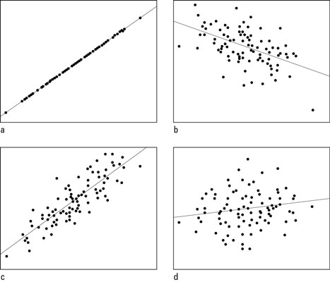
Scatterplots with correlations of a) +1.00; b) –0.50; c) +0.85; and d) +0.15. Reprinted from How to Interpret a Correlation Coefficient r, by D. J. Rumsey, n.d. Retrieved from https://www.dummies.com/education/math/statistics/how-to-interpret-a-correlation-coefficient-r/
You can use the pandas library to calculate a correlation. For example, if you had a dataframe named df, you could generate a matrix with the correlation coefficients for each pair of columns with the following line of code.
df.corr()

However, we do have to be careful with correlation coefficients. The simple number returned only indicates how well the two variables are linearly related. That is, if they fit well on a line.
For example, in the graphs below we have plotted a variable named Level of Alertness in relation to the variable Time Since Waking (hours).
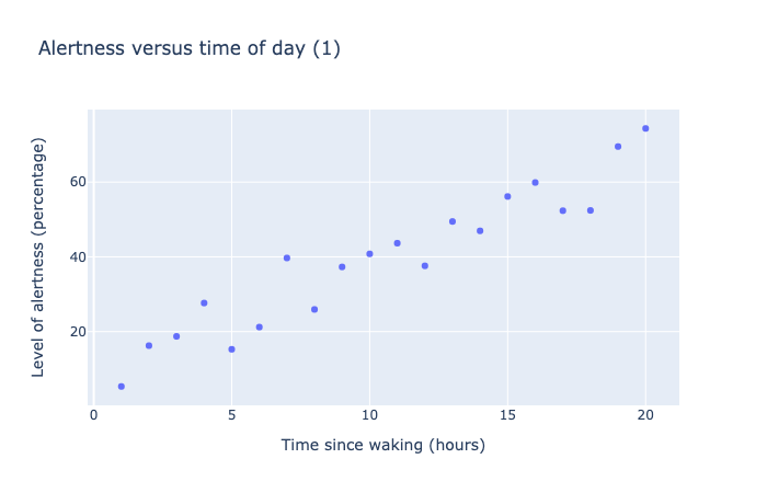
This scatter chart shows 20 data points measure level of alertness as a oercentage versus time of day, as measured in hours from time of waking. The data shows a roughly linear trend, going from 0% at 0 hours to 80% at 20 hours.
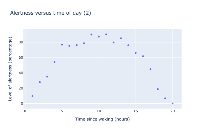
This scatter chart shows 20 data points measure level of alertness as a oercentage versus time of day, as measured in hours from time of waking. The data shows a parabolic trend, starting from 0% at 0 hours, rising to a maximum of 100% at 10 hours, then dropping back to 0% at 20 hours.
In the first plot, the data points fall nearly into a linear increase, and the correlation coefficient computed is 0.95—a strong correlation as expected.
In the second plot, there clearly is a relation between wake time and alertness (we get more alert in the day, then after 10 hours, the alertness drops off), but the correlation coefficient is only -0.17, suggesting little correlation.
The problem here is the correlation follows a quadratic pattern, not linear, and the automatic calculation of correlation misses this fact.
Insights like these are why it is helpful to analyze data with visualizations in addition to calculating statistics, rather than just using one method or the other.
🏁 Activity:#
Get the most out of this section by opening a Jupyter notebook in another window and following along. Code snippets provided in the course can be pasted directly into your Jupyter notebook. Review Module 2, Unit 5 for a refresher on creating and opening Jupyter notebooks in Callysto.

In earlier modules we explored an example data about pet adoption. We might wonder if some of the characteristics of a pet are related to the time it takes for it to be adopted.
Let’s take a look at this data again. Which variable has the strongest correlation to time to adoption?
Use your Python skills to load in the DataFrame and compute some coefficients. A key part of the code will look like this:
import pandas as pd
url = "https://tinyurl.com/y917axtz-pets"
pets = pd.read_csv(url)
pets.corr()
By checking the correlations, you should find that weight and age are closely correlated with the time to adoption.
Is the correlation coefficient a positive or negative number? This will tell you whether time to adoption increases or decreases with the compared variables.
Curve fitting#
The process of curve fitting involves finding a mathematical function — a curve or a straight line — that describes the pattern in the data. This helps us to describe the data, and aids with interpolation (estimating data points that are between other points) or extrapolation (estimating beyond the data).
Earlier in the course we explored some different linear fits to data. This is when we try to model our data as one variable, say y, as a linear function of another variable x.
This can be expressed as the formula
y = a + bx
where the parameters a and b can be calculated by the computer to get the best fit to the data.
A quadratic function looks like
y = a + bx + cx²
where the extra x² term makes this into a quadratic, or parabolic form.
It is possible to add higher order terms (cubes, fourth order, etc.) but keep in mind what Einstein had to say about simplicity:
“Everything should be made as simple as possible, but no simpler.”
A function with fewer terms, or fewer parameters (a, b, c) is considered simpler than one with many terms and many parameters.
An exponential function can be fit following the formula
y = a * e^(bx)
Again, the parameters a and b can be calculated by the computer to find the best values that fit the data.
There are many methods for calculating and plotting curve fits. One library that we can use is scipy.optimize.curve_fit.
For example, let’s take the Alertness data from above, and fit a quadratic function to it.
The code to do this is straightforward: we define a function func that computes the quadratic function y = a + bx + cx² then passes it to the curve_fit function along with the x and y data points.
from scipy.optimize import curve_fit

def func(x,a,b,c):
    return a + b*x + c*x**2

curve_fit(func, x, y)
This code returns the best values for a, b, c:
[-7.70701503, 19.5718588, -0.98516245]
We then use those three numbers in the formula
y = a + bx + cx²
to add a curve to our data points in the plot. Notice how well the curve agrees with the data points in the following plot:
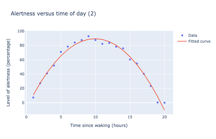
This scatter chart shows 20 data points measure level of alertness as a percentage versus time of day, as measured in hours from time of waking. The data points show a parabolic trend, starting from 0% at 0 hours, rising to a maximum of 100% at 10 hours, then dropping back to 0% at 20 hours. A best-fitting parabolic curve is plotting along the data points, showing a very good fit to the data.
For a more in depth explanation on how to fit curves with SciPy, check out this SciPy Curve Fitting tutorial from the website GeeksforGeeks.
Cluster Analysis#
Cluster analysis involves grouping similar values together.
For example, here is a plot showing how many days per year students miss at school, given their age.
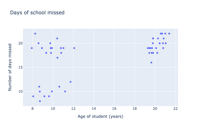
This scatter chart shows 50 data points indicating the relationship between the age of students and the number of school days missed in a year. The data seems to fit into three distinct clusters: young students with few days missed, young students with many days missed, and older students with many days missed.
In this plot the data seems to cluster into three groups, which allows us to hypothesize that they represent three specific groups of students:
Students ages 8-12 who miss a lot of school
Students ages 8-12 who don’t miss a lot of school
Students ages 19-22 in the post-secondary range who miss lots of classes.
With data like this, we can see trends in the forum of clusters, rather than a linear, quadratic, or exponential progression. It makes more sense to try to define these clusters rather than force a mathematical formula to the data.
For more information about cluster analysis, check out the Wikipedia article and this guide to the Python module.
Today many researchers are turning to artificial intelligence and machine learning tools to help with cluster analysis, a rich and exciting new area of data science.
Beyond this very basic introduction, statistics is a large field with many additional resources and courses available should you be interested in pursuing them!
🏁 Activity:#
Let’s try some curve fitting! Use the online tool, mycurvefit.com, to fit a curve to the following data:
x = [1, 2, 3, 4, 5]

y = [1, 5, 10, 15, 25]
If this goes well, try making up your own data points and fitting a curve to them.

