
Module 5 Unit 4 - Addressing assumptions#
Data and visualizations are useful for making decisions and informing opinions. This is particularly true when a scenario is outside of our normal experience or in situations where our intuition may lead us astray.
For example, earlier in the course we explored the negativity instinct and how it can impact our beliefs about the state of the world.
In addition to the negativity instinct, the book Factfulness identifies nine other tendencies humans have that cause them to “misinterpret facts and see them as more dramatic than they are.” This can include the straight line instinct (our tendency to assume that current trends will continue) and the destiny instinct (our tendency to not notice changes that occur slowly over long periods of time).
The challenge of exponential change#
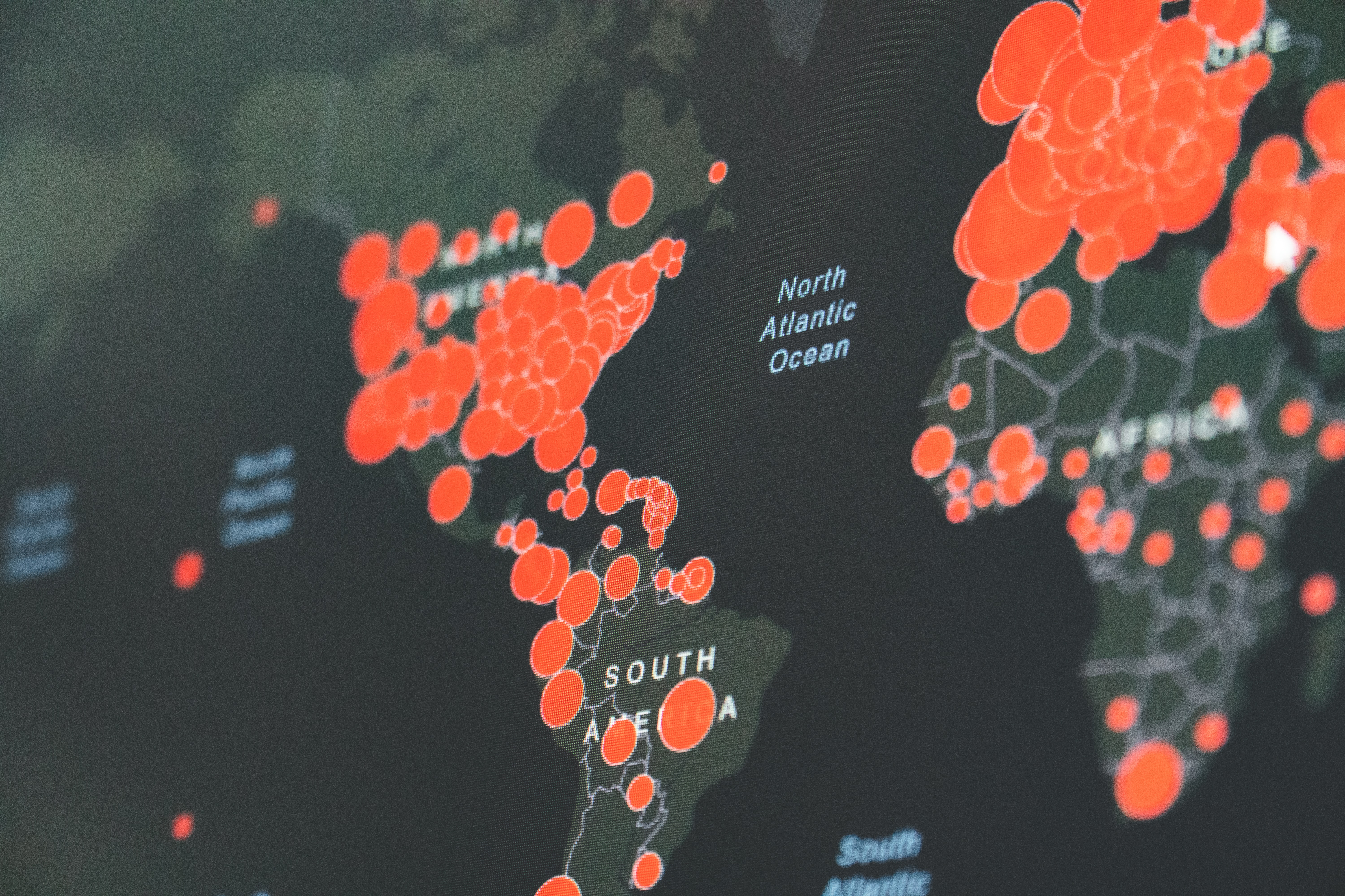
One type of trend in data that humans have a particularly hard time conceptualizing is exponential change. Exponents run counter to both our straight line and destiny instincts.
There are many things that can change exponentially in our world such as: populations, viral infections, computer processing speed, digital resources (i.e. databases), stock prices, and money through compound interest. Being able to analyze, visualize, and interpret this data effectively is becoming increasingly important.
Albert Bartlett, an influential scholar in the field of physics and population growth, once said
“The greatest shortcoming of the human race is our inability to understand the exponential function.”
We can see this in the intuitive answers often given to the following problem:
A pond has a lily plant growing at an exponential rate, doubling in size each day. If the pond looks clear on the first day and is completely covered on the 30th day, when is the pond half covered?
Our instincts lead us to assume that the pond should be half covered around halfway through the time interval. However since the plant doubles every day — an exponential growth pattern — it would be half covered on the second-last day.

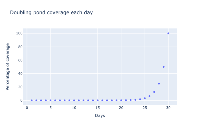
A scatter plot of percentage of pond coverage versus number of data. Days run from 0 to 30 while percentage runs from 0 to 100%. The points show exponential growth, with percentage doubling each day. Note the rapid rise in coverage during the last five days.
This graph plots the coverage of the pond, showing changes that seem incredibly slow until they are suddenly and seemingly out of control.
In fact, the pond is not even one tenth of 1% covered until about day 20. We can see this by zooming in on the first 20 days of this growth data, as shown below. Note how the y-axis now ranges from 0 to 0.1%.
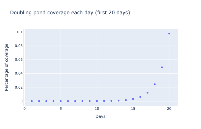
A scatter plot of percentage of pond coverage versus number of data. Days run from 0 to 20 while percentage runs from 0 to 0.1%. The points show exponential growth, with percentage doubling each day. Note the rapid rise in coverage during the last five days of the plot.
Even at this much smaller scale — with growth measured in hundredths of a percent — we again see a pattern of very slow growth for the first few days, followed by a rapid acceleration after 15 days.
Misleading data#
Data and data visualizations can be powerful tools for identifying trends, clarifying information, and counteracting flawed assumptions. However, if data is gathered, cleaned, or represented using flawed methodology, it can be misleading.
Bias can easily impact our judgment when designing a project, whether conscious or unconscious, and is one of the reasons why most research is not taken seriously until it has gone through a peer-review process.
🏷️ Key Term: Peer review#
Peer review is a process by which research is evaluated for quality by other members of the scientific community with expertise in the same field. Peer reviewers check the project write-up for accuracy and assess the validity of the research methodology and procedures. In many cases, reviewers will suggest the author make revisions before publishing, but if they consider the project to be of poor quality, they may reject it entirely.
A case where research was criticized for possible bias was in the 1909 Oil drop experiment. In the study, scientists Robert A. Millikan and Harvey Fletcher demonstrated a way to determine the exact charge of an individual electron by measuring how quickly tiny oil drops fell through the air.
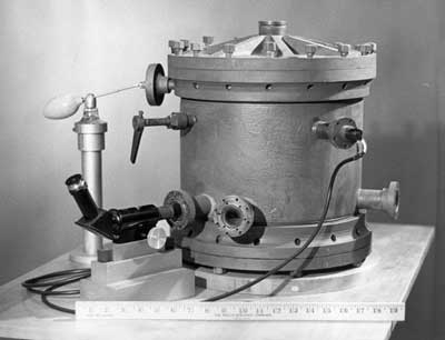
Millikan’s original oil-drop apparatus (1909)
The work was a remarkable achievement, however controversy arose nearly 60 years later when historian Gerald Holton found evidence that more observations had been recorded than were published. This led him to question whether the scientists had deliberately discarded results that didn’t match their hypothesis.
Further investigation revealed that the elimination of data points was done not to mislead, but to decrease the error in the results. However, the discussion was valuable in that it created space to reevaluate assumptions and further confirm the validity of the work.
Persuasive data presentation#

It’s possible to eliminate or select particular data with the goal of persuading others to interpret it a certain way.
For example, let’s say we wanted investors to feel positive or negative about the stock price of the American electric car company Tesla Inc..
Below is a graph of Tesla’s stock prices in 2019.
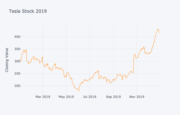
This is a line plot of the value of Tesla stock in the stock market during the period January to December, 2019. There is a lot of variation in the stock value, starting at about \(300 in January, dropping to \)180 in June, then rising in jumps to $430 in December.
By selecting just a specific slice of this graph, we can easily emphasize a rise or fall in the stock price and imply a particular trend.
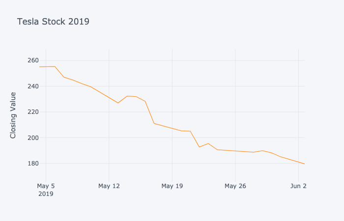
This is a line plot of the value of Tesla stock in the stock market during the period May 3 to June 2, 2019. This limited plot shows a downward trend, with the stock decreasing in value from \(255 to \)180 over this period.
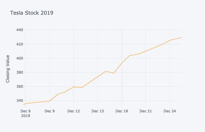
This is a line plot of the value of Tesla stock in the stock market during the period December 6 to 26, 2019. This limited plot shows a rapid upward trend, with the stock increasing in value from \(335 to \)430 over this period.
Depending on how a visualization is constructed, it can emphasize small differences or de-emphasis large differences.
Take the examples below. Each bar chart was constructed using the same data.
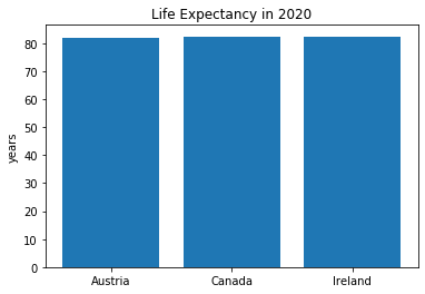
This bar chart shows the life expectancy in years for three countries: Austria, Canada and Ireland. All three show a expectancy of just over 80 years.
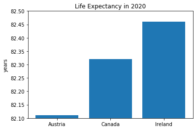
This bar chart shows the life expectancy in years for three countries: Austria, Canada and Ireland. The chart is zoomed in at the 80 year mark, emphasizing the differences in the three numbers (82.1, 82.3, 82.45).
In the second graph the y-axis values have been chosen to emphasize the differences in values. Now imagine if that graph was displayed without y-axis labels—we might come away with an unrealistic impression of how different life expectancies are between Austria, Canada, and Ireland!
Explore#
This article from StatisticHowTo.com provides a wide variety of examples of how data visualizations have been constructed in a way that is misleading. Misleading Graphs: Real Life Examples
It is important to be skeptical of data, visualizations, and interpretations. You should also be critical of your own work, asking yourself questions such as:
Could there be any bias in the way we’ve collected or displayed the data?
Did we start out by trying to prove a point, or have we been exploring the data with an open mind?
Have we labelled our axes and used appropriate scaling?
Is there a possibility that others could be confused or misled by what we are presenting?
Do the results vary significantly from conventional or intuitive understanding? If so, is this justifiable?
Can we communicate any uncertainties using confidence intervals or error bars?
🏷️ Key Term: Confidence intervals#
A confidence interval estimates a random parameter using an interval of values rather than a single value. For instance, when we say “Tomorrow’s high temperature will be between 20 and 22 degrees Celsius,” we are using a confidence interval. The level of confidence can be specified as well: “It is 90% likely that tomorrow’s high temperature will be between 20 and 22 degrees Celsius.” Which would mean that this prediction is accurate 9 times out of 10. Political pollsters often report results as confidence intervals. For instance, they might ask 1000 people if they prefer candidate A over candidate B. If 60% of those 1000 people say A, the pollsters estimate that in the general population (which might include millions of people), between 55% and 65% prefer candidate A, and they report this interval as accurate 9 times out of 10.
🏷️ Key Term: Confidence intervals#
Error bars report the accuracy of measurement of a single, true value. Unlike a confidence interval, there is no “randomness” here. Error bars allow us to be honest about how accurately we measure or report a number. For instance, if I say “I weigh 150 pounds” it would be more realistic to say “ I weigh 150 pounds, plus or minus 5 pounds.” After all, we don’t expect a bathroom scale to be very precise. If we were buying a gold bar, we would expect more accuracy, like “150 grams, plus or minus 0.01 grams.” ( 0.01 grams of gold is worth about 75 cents, so we can see why we want lots of accuracy!).
Spurious relationships#

Not every trend or relationship that we identify in data is valid for decision-making. Sometimes we see correlations between variables that are not causal, or even related. These are known as spurious correlations.
person holding ice cream with a cone near a body of water during the daytime
If we found a correlation between increased ice cream consumption and increased drownings in lakes, it would not necessarily mean that eating ice cream causes drowning. In this case, it seems more likely that a third variable, such as warmer weather is the cause of both.
While in that example the variables were at least related, spurious correlations can also appear between entirely unrelated data variables.
An example of this is the so-called Washington Football Team Rule. In this rule, the results of National Football League (NFL) games between 1940 and 2000 correlated strongly with the results of subsequent United States presidential elections.
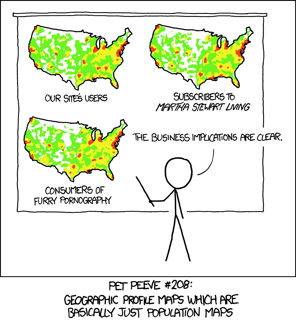
“Heatmap” by XKCD is licensed under CC BY-NC 2.5
🏁 Actviity#
The Spurious Correlations website has many excellent examples of real, yet unrelated data variables that appear to be closely correlated.
Pick out an example from the site and discuss it.
What are the reasons why these sets of data should be related?
Are there any reasons why they could be related?
See if you can come up with a well thought-out argument why the correlation is spurious, or why there may be a connection after all!

