Module 4 Unit 2 - Choosing the Right Type of Visualization for your Data#
This section contains tutorials! Get the most out of them by opening a Jupyter notebook in another window and following along. Code snippets provided in the course can be pasted directly into your Jupyter notebook. Review Module 2, Unit 5 for a refresher on creating and opening Jupyter notebooks in Callysto.
A visualization is only useful if it helps us to understand our data set better or communicate information about it more accurately and powerfully.
4 dogs looking over a wall
When choosing to visually represent data, remember what question you want to answer and ask yourself if what the visualization is presenting is relevant to your question.
Let’s get some practice representing our pets data set from the previous module provided by Bootstrap World in different ways.
Run the following code in your Jupyter notebook to import the pandas library and recreate the pets DataFrame.
#load "pandas" library under the alias "pd"
import pandas as pd

#identify the location of our online data
url = "https://tinyurl.com/y917axtz-pets"

#read csv file from url and create a dataframe
pets = pd.read_csv(url)

#display the head of the data
pets.head()
The result should look like this:

Code Comments#
Have you noticed that some lines in code begin with a # symbol and seem to be written in plain English?
In Python, lines that begin with # are comments — basically, notes for any humans looking at the code. The # tells the compiler to ignore the line, as it is not intended to be read by a computer.
Comments are useful when teaching others about what specific parts of our code do. They also can help us keep our code organized, remind us about important information, and allow people less familiar with our code to understand it more easily.
🏁 Tutorial: Tutorial: grouping variables#
Our pets data set contains much more data than the lists we used to create data visualizations in Unit 1. For example, the head of the DataFrame shows us that for each animal eight different variables have been recorded.
Let’s start by picking a few columns we are interested in and get counts of the different values within those columns.
Gender
Species
Age (in years)
To do this, we’ll use the pandas method groupby, which lets us split data into groups and give those groups names so they can be easily referenced.
Step 1
Run the code below to group data in the gender, species, and age columns of the pets DataFrame by count.
# Group by different Categories: Gender, Species, Age (years)
gender = pets.groupby("Gender").size().reset_index(name="Count")
species = pets.groupby("Species").size().reset_index(name="Count")
age = pets.groupby("Age (years)").size().reset_index(name="Count")
The variable pets refers to our DataFrame of information. Writing the code pets.groupby(“Gender”) creates a new dataframe that groups the information by the two genders Male and Female. Extending the line of code to pets.groupby(“Gender”).size() creates a column indicating the size of each group (Male, Female), and appending reset_index(name=”Count”) gives an informative name for this size data.
Step 2
Now that we’ve created our groups, let’s call each group name and see what it looks like as a table.
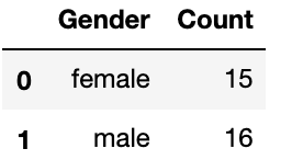
gender

This is a dataframe that indicates that 15 pets are female, while 16 pets are male. The 0 indicates the first row - in Python we start counting from zero. This is the index of the row, and corresponds to the row female, with count value 15. The 1 indicates the second row, and corresponds to the row male, with count value 16.
📚 Read#
First five rows of a DataFrame containing data on pet adoption. DataFrame contains eight columns with information about each pet: ‘Name’, ‘Species’, ‘Gender’, ‘Age’ (in years), ‘Fixed’, ‘Legs’, ‘Weight’ (in lbs), and ‘Time to Adoption’ (in weeks). Each row corresponds to one pet, and the rows contain complete information for each of the columns.
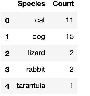
species

This is a dataframe that indicates there are five different species in the dataset, and tells us how many of each pet is within the dataset. From the first row (index 0), we see there are 11 cats, from the second row (index 1), there are 15 dogs, from the third row (index 2) there are 2 lizards, from the fourth row (index 3), there are 2 rabbits, and from the fifth row (index 4) there is only 1 tarantula.
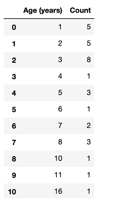
age

This is a dataframe that indicates there are 11 unique ages found within the pets. On the first row (index 0), we see that 5 pets are 1 year old. On the second row (index 1), we see that 5 pets are 2 years old. On the third row (index 2), we see that 8 pets are 3 years old. On the fourth row (index 3), we see that one pet is 4 years old. On the fifth row (index 4), we see that 3 pets are 5 years old. On the sixth row (index 5), we see that one pet is 6 years old. On the seventh row (index 6), we see that 2 pets are 7 years old. On the eighth row (index 7), we see that 3 pets are 8 years old. On the ninth row (index 8), we see that one pet is 10 years old. On the tenth row (index 9), we see that one pet is 11 years old. On the eleventh row (index 10), we see that 1 pet is 16 years old.
Activity#
We now have three different subsets of data we could make visualizations from. But what type of visualization should we choose for each one?
Each one of these data subsets could easily be represented by a pie chart, scatter plot, or bar chart. Try matching the data sets with different visualizations to see what the resulting chart or graph would look like.
Reflective questions
Do you have a preferred data visualization for each data subset? If so, why?
Is it sometimes hard to choose between data visualizations?
Do any of the data visualizations seem like they might misrepresent the data, or cause confusion?
Creating clear and useful visualizations#
Sometimes a particular visualization represents data better than others.
Let’s look at some examples created with Plotly Express, a library with lots of great tools for creating nice-looking data visualizations.
Suppose we wanted to see the relationship between age and time to adoption for the pets in our data set. The code below allows us to generate a bar graph to compare these variables.
Try running it now.
import plotly.express as px

# Create bar plot
bar_pet = px.bar(pets,
       x="Time to Adoption (weeks)",
       y="Age (years)",
       title="Age (in years) and Time to Adoption (weeks) for each pet")

# Display within our Jupyter notebook
bar_pet.show()
The code line that starts bar_pet = px.bar(pets,… calls up the function bar in the Plotly library to create a bar chart from the data in the pets DataFrame. The line x=”Time to Adoption (weeks)” says the horizontal axis in the bar chart will take data from the “Time to Adoption” column in the DataFrame. A similar line y=”Age (years)” tells us what column provides data for the vertical axis. The title line adds a nice title to our bar chart. And finally, the command bar_pet.show() tells the computer to show us the chart by displaying it on the screen.
The output should look like this:?
Looking at this bar graph, there seems to be a relationship between age and time to adoption, but some aspects of the visualization are not clear. For example, most of the bars are segmented, but there is no explanation of what the segments represent.
Let’s update our data visualization to include more information. We’ll use colour to represent pet species and add labels with the names of each pet.
Run the code below.
# Create coloured bar chart
bar_pet = px.bar(pets,
       x="Time to Adoption (weeks)",
       y="Age (years)",
       title="Age (in years) and Time to Adoption (weeks) for each pet",
       color="Species",text="Name")

bar_pet.show()
The output should look like this: ?
These updates have made the bar chart easier to interpret. However, there’s a lot of information represented here and the chart doesn’t clearly display the relationship between age and time to adoption.
Some elements are also confusing. For example, some pets have tiny name labels and bar segments compared to others, but this doesn’t communicate anything useful about their data—the chart type simply allows less room when different pets have similar ages and times to adoptions.
Let’s try a different type of visualization.
Run the code below to create a scatter plot. In this visualization, each dot will represent a single pet and the dot’s colour will represent the species.
# Create scatter plot
scatter_pet = px.scatter(pets,
       x="Time to Adoption (weeks)",
       y="Age (years)",
       title="Age (in years) and Time to Adoption (weeks) for each pet",
       color="Species",hover_name="Name")

scatter_pet.show()
The output should look like this: ?
This scatterplot communicates our information more clearly than our bar graph. It allows each pet to be represented equally, shows the strength of the relationship between our two variables, and allows us to easily identify outliers and see the different species of pets in our data set.
📚 Read#
This resource from teacher and science journalist Peter Aldous breaks down some of the common elements of a data visualization. Data visualization: basic principles
Conclusion#
Not all data visualizations are equally useful — depending on how we design them, they might actually make our data harder to understand or mislead us to assume things that are untrue.
When creating visualizations, our goal should be to clearly present information that relates to the question we want to answer.
However, there also is no hard and fast rule about which method is best. Different data calls for different approaches. The most important thing is to be able to easily see patterns and draw conclusions.
Explore#
This Jupyter notebook provides a walkthrough of the tutorials in this unit for easy exploration and can be shared with students or colleagues.
In the next unit we’ll explore how to make the most of data visualizations inside a Jupyter notebook.

