
Module 4 Unit 1a - Advanced Data Visualizations#
Python is capable of producing nearly any kind of representation of data we can imagine. Let’s explore other interesting data visualizations beyond the simple ones we explored in the last unit.
While we won’t walk through how to create these data visualizations, we’ll include links to resources if you’d like to try working with them on your own.
Data visualizations included in this unit:
Word clouds
Node diagrams
Animated data visualizations
3D data visualizations
Word Clouds#
Word clouds, sometimes called tag clouds or text clouds, are a way to visually represent textual data.
Word clouds consist of a jumbled collection or cloud of words displayed in different sizes. The size of the word is proportional to how often it appears in the data set. A word that is mentioned often will be larger than a word that appears less frequently.
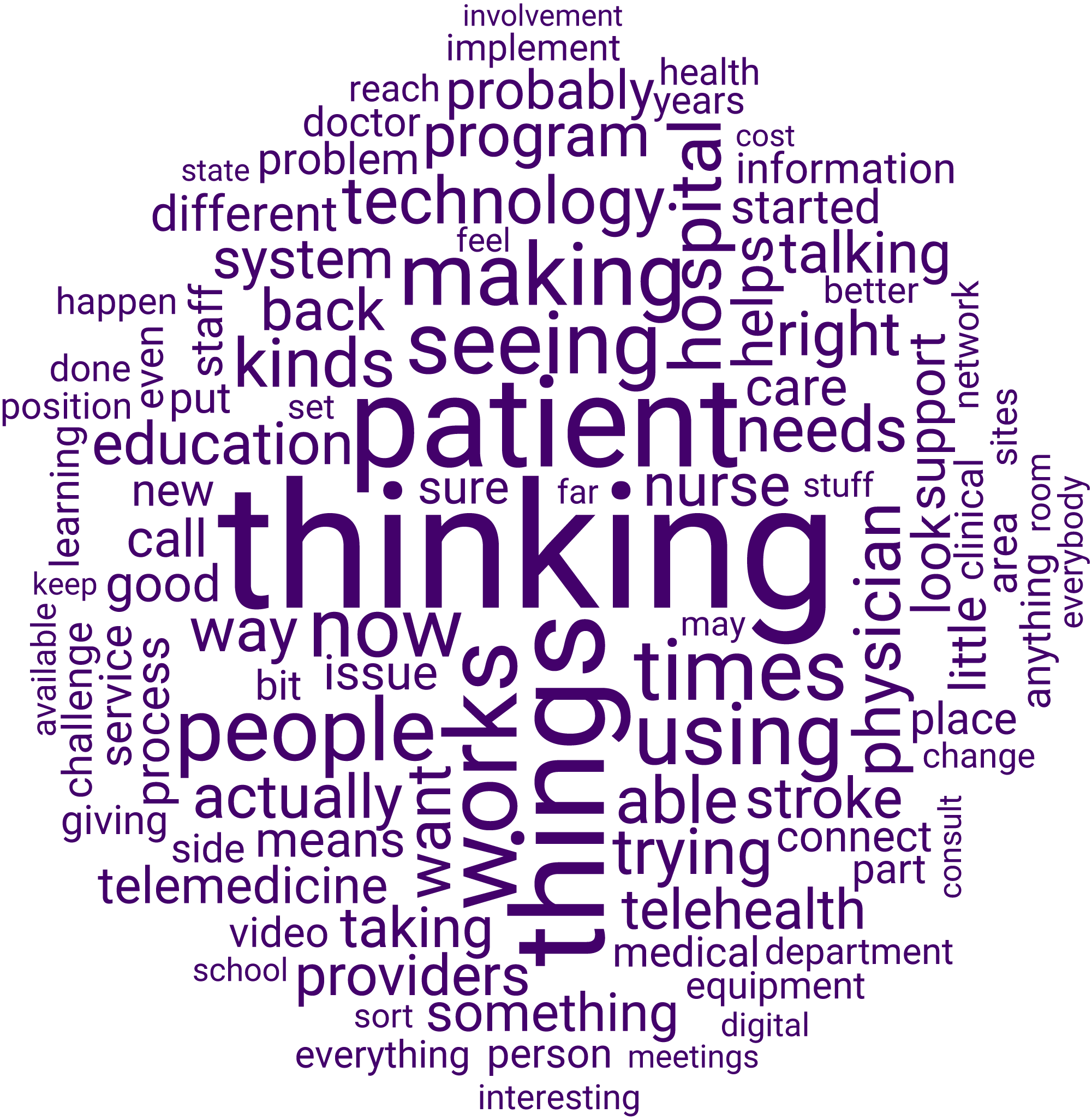
Adapted from “An Interpretative Phenomenological Analysis of Telehealth Champions”, by DuBose-Morris, R. 2014. P. 77. Available from https://www.researchgate.net/publication/270904354_An_Interpretative_Phenomenological_Analysis_of_Telehealth_Champions
Word clouds can help us to quickly identify key words in a data set, compare how different data sets use words, and recognize themes or strong patterns.
They’re also visually interesting, and can be used to liven up a presentation or report.
Explore#
This Callysto tutorial describes how to create and customize the appearance of basic word clouds using Python code.
Node Diagrams#
Node diagrams — also called network diagrams — consist of nodes (also called vertices) presented as dots or circles, and links (also called edges) presented as lines or arrows.
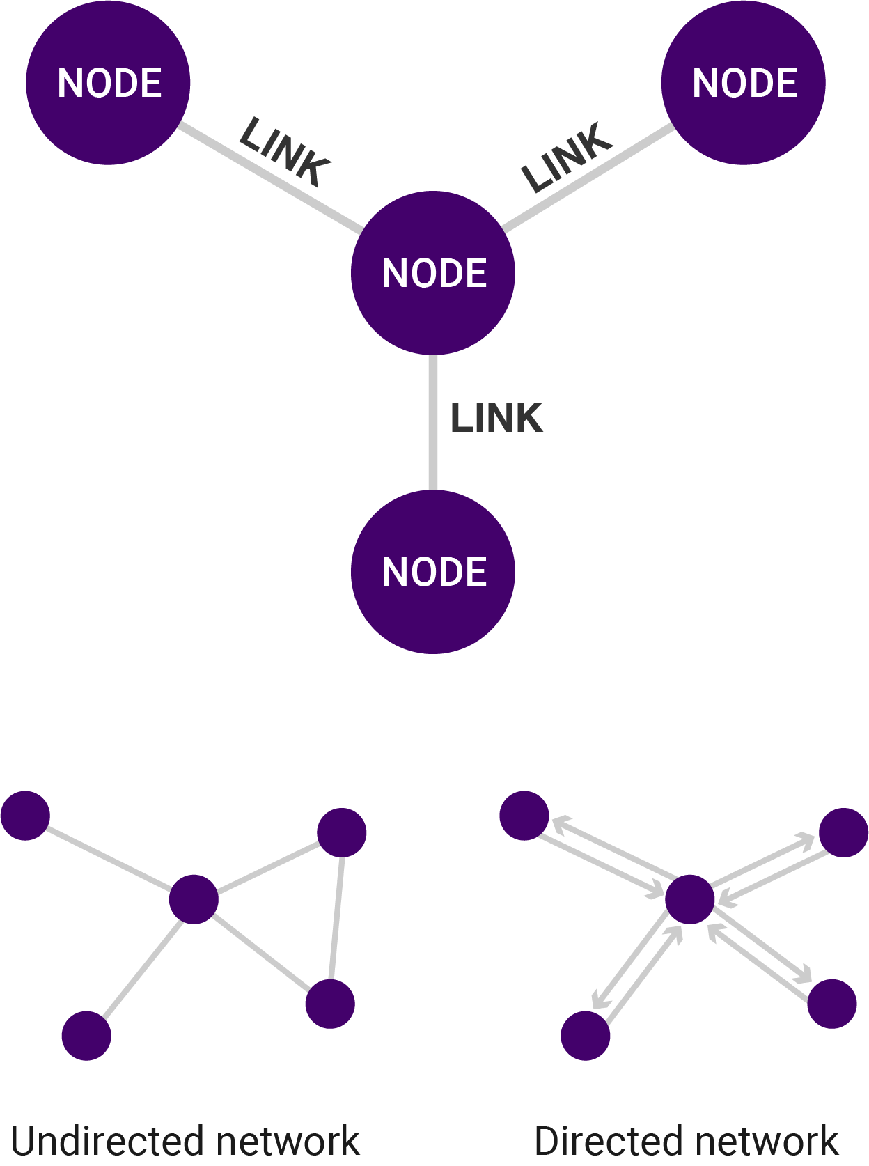
Adapted from Network Diagram in The Data Visualisation Catalogue, n.d. Retrieved from https://datavizcatalogue.com/methods/network_diagram.html
Each node represents an object, individual, or group. The links represent the relationship between them.
Explore#
This documentation explains how to create a node graph using the Python library NetworkX. Network X Tutorial
Animated Data Visualizations#
One way to visually represent data that changes over time is with animation. This is particularly helpful when a significant change in data is challenging to communicate in a single image.
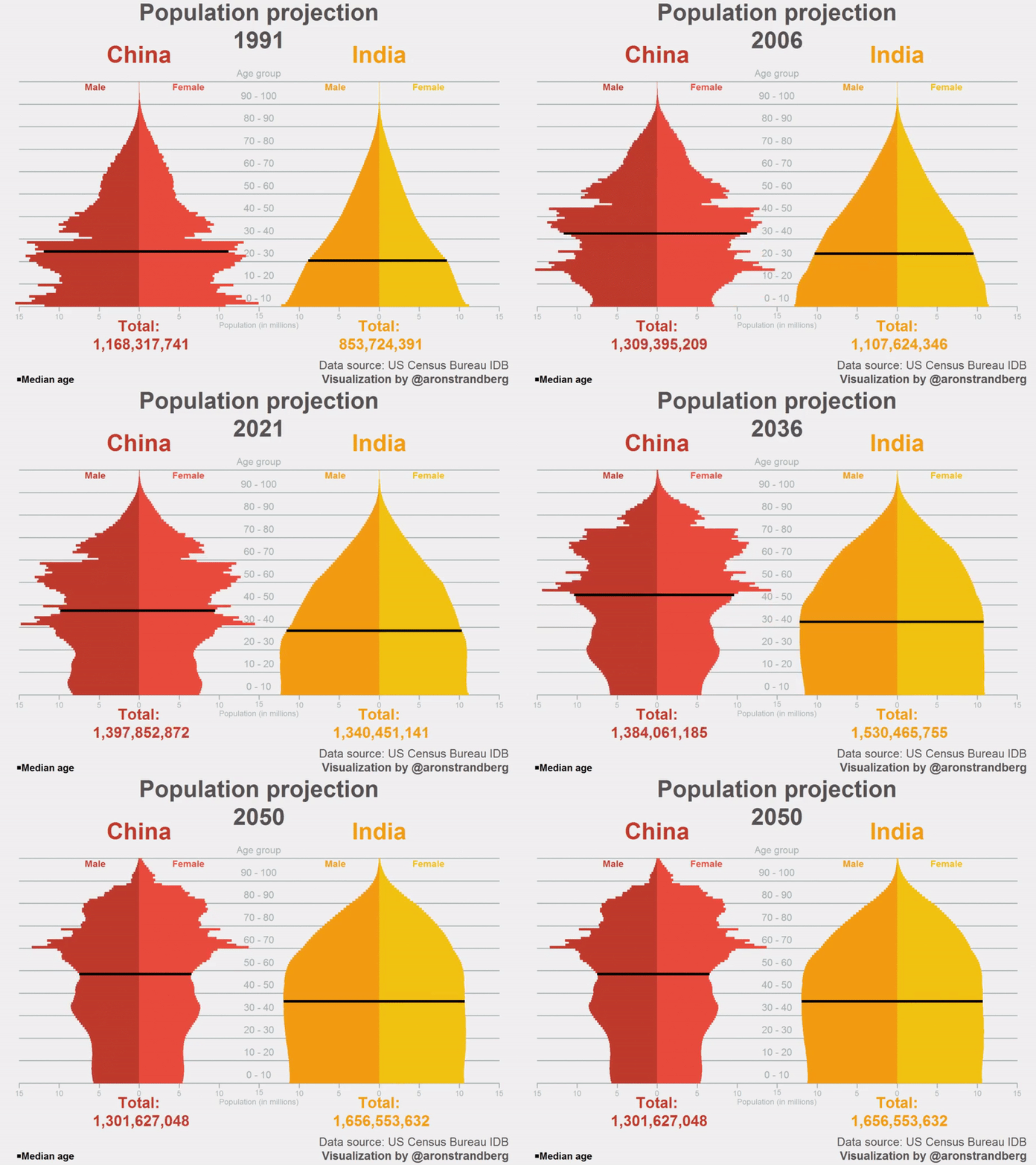
Reprinted from “Projection: #India overtaking #China as the world’s most populous country” [Twitter Post], by Strandberg, A. 2015, November 25. Retrieved from https://twitter.com/aronstrandberg/status/669679757735383041
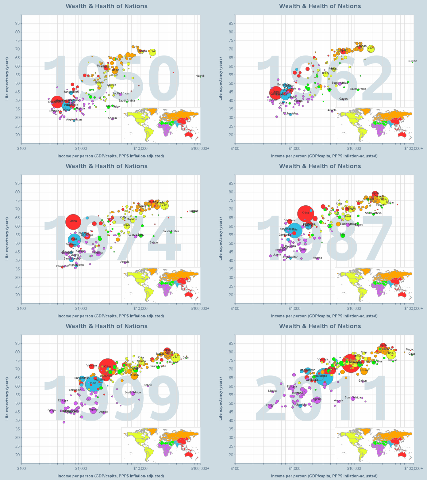
“Wealth & Health of Nations” by Gapminder is licensed under CC BY 3.0.
Explore#
This short article demonstrates a method for animating a simple line graph using Python. Creating Animated Graphs in Python
3D Data Visualizations#
Most of the data visualizations we’ve explored present data in just two dimensions. Tricks like animation or modifying the shape and colour of elements can allow us to do more, but data is still presented primarily in two dimensions — with x and y axes.
However, some visualizations can present data in three or even four dimensions.
In the 3D scatter plot below, the variables sales, cost, and year are plotted against each other for a number of different products.
Visualization #1
This next visualization is considered 4D, because it maps colour onto a 3D surface to allow a fourth variable to be represented.
Visualization #2
Explore#
This Jupyter notebook provides a quick introduction to 3D+ plotting with Plotly.
📚 Read#
This short article describes some different methods for creating 3D data visualizations with Python.An easy introduction to 3D plotting with Matplotlib.
🏁 Activity#
Reflective questions
What kind of data visualizations would allow you to determine the frequency of words within text?
What is one way you can represent the relationship between members in an organization and their roles using the visualizations we covered in this unit?
Contribute to the discussion
