
Module 4 Unit 1 - What is data visualization?#
Data Visualization#
It can be hard to observe interesting or useful patterns in data when looking at a table. It’s even harder when data sets are big, like the ones used by researchers and data scientists.
Data visualizations are graphic representations of data. They let us see data in a way that’s less abstract than columns and rows of values, and to quickly gain and communicate insights about those values.
For example, let’s say we wanted to meet up at a restaurant in another part of town we weren’t familiar with. A spreadsheet of all the GPS coordinates and street addresses of public and commercial spaces in town would technically be relevant to helping us find our way but not super practical.
notebook on a map
However, if the data was plotted out on a map — a classic example of a data visualization — we could quickly see information like:
how far the restaurant is,
what other businesses are in the area,
if there was a transit stop nearby, and
possible routes we could take.
Maps are just one example. Graphs, charts, word clouds, diagrams, infographics, and more can help us better understand and make use of all kinds of data sets.

Maps are just one example. Graphs, charts, word clouds, diagrams, infographics, and more can help us better understand and make use of all kinds of data sets.
hand holding a phone displaying stock exchange
Census data can help policy makers allocate resources to growing communities. Conservation groups can track the health and movement of endangered species. Business analysts can identify consumer trends, and educators can see the distribution of grades in a class.
📚 Read#
We can use code to create a wide variety of different kinds of visualizations in Juptyer notebooks. Let’s explore a few of them now.
Common types of data visualizations#
Bar Chart#
One of the exciting things about modern data science tools and techniques is how they let us work with big data.
Big data is a collection of observations that are too large or complex to be effectively analyzed by traditional data processing software and methods.
Big data also represents a shift in the way people and organizations think about data.
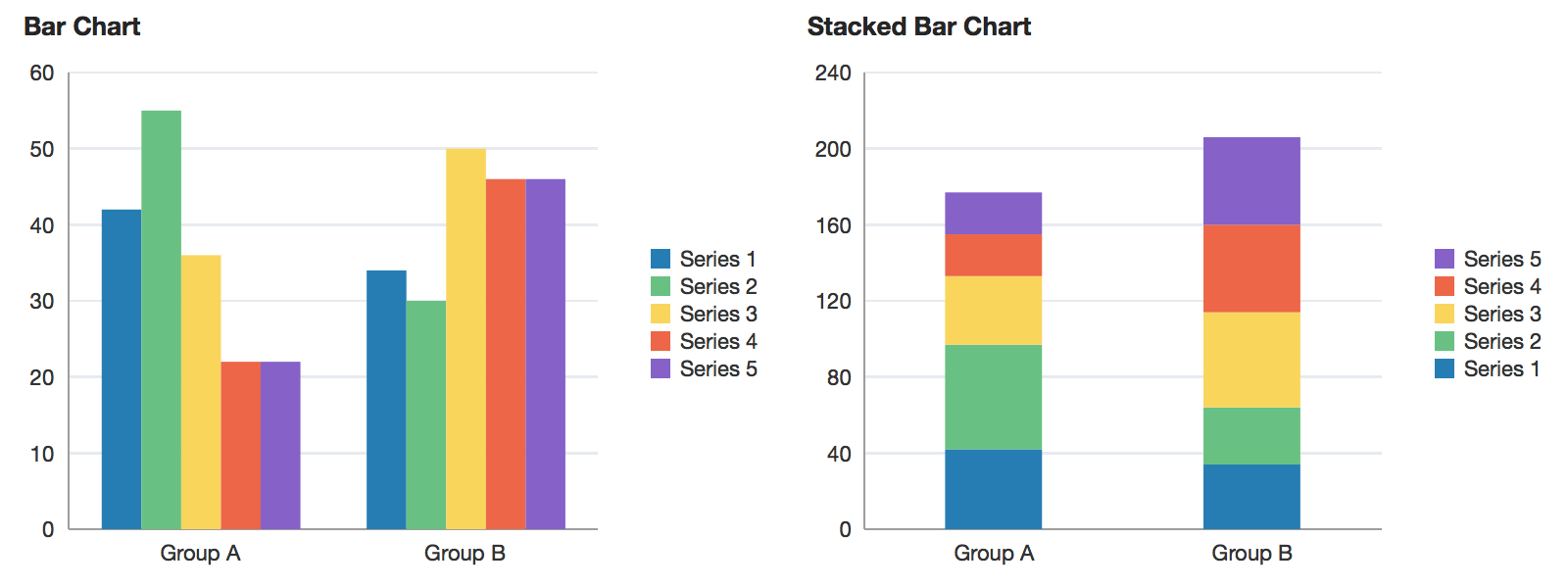
An example of a bar chart and stacked bar chart. Reprinted from “barChart”, in Oracle, 2014. Retrieved from https://docs.oracle.com/middleware/1213/adf/tag-reference-dvt/tagdoc/dvt_barChart.html
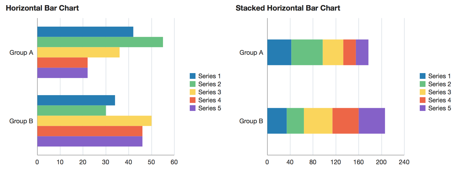
An example of a horizontal bar chart and a stacked horizontal bar chart. Reprinted from “horizontalBarChart”, in Oracle, 2014. Retrieved from https://docs.oracle.com/middleware/1213/adf/tag-reference-dvt/tagdoc/dvt_horizontalBarChart.html
A bar chart (sometimes also referred to as a bar graph) displays data using rectangles (bars).
This type of visualization is frequently used to display categorical information, with categories listed along one axis and numerical values along the other.
The bars can be plotted either vertically or horizontally and can be stacked on the side, or on top of one another.
Scatter Plot#
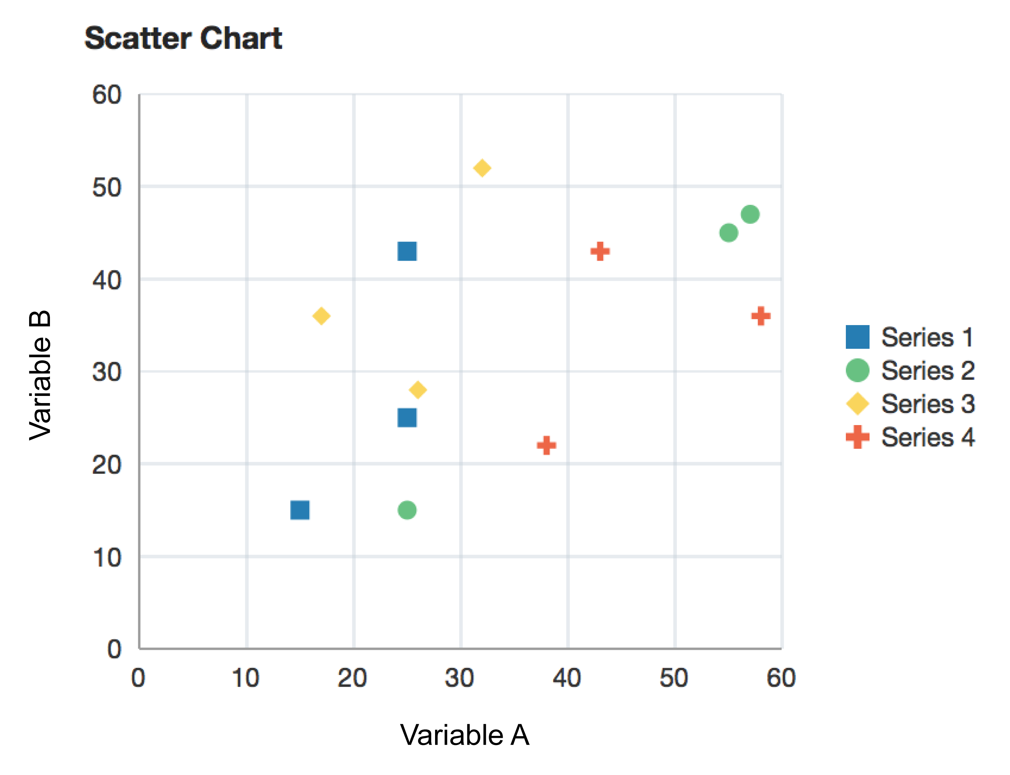
An example of a scatter chart. Reprinted from “scatterChart”, in Oracle, 2014. Retrieved from https://docs.oracle.com/middleware/1213/adf/tag-reference-dvt/tagdoc/dvt_scatterChart.html
A scatter plot (also called a scatterplot, scatter graph, scatter chart, scattergram, or scatter diagram) uses the Cartesian coordinate system to display values for two variables for a set of data.
For example, many geographic maps use longitude and latitude as their two variables.
We can also add a third variable to the points on our graphs, such as by giving them specific colour, shape, or size.
Line Chart#
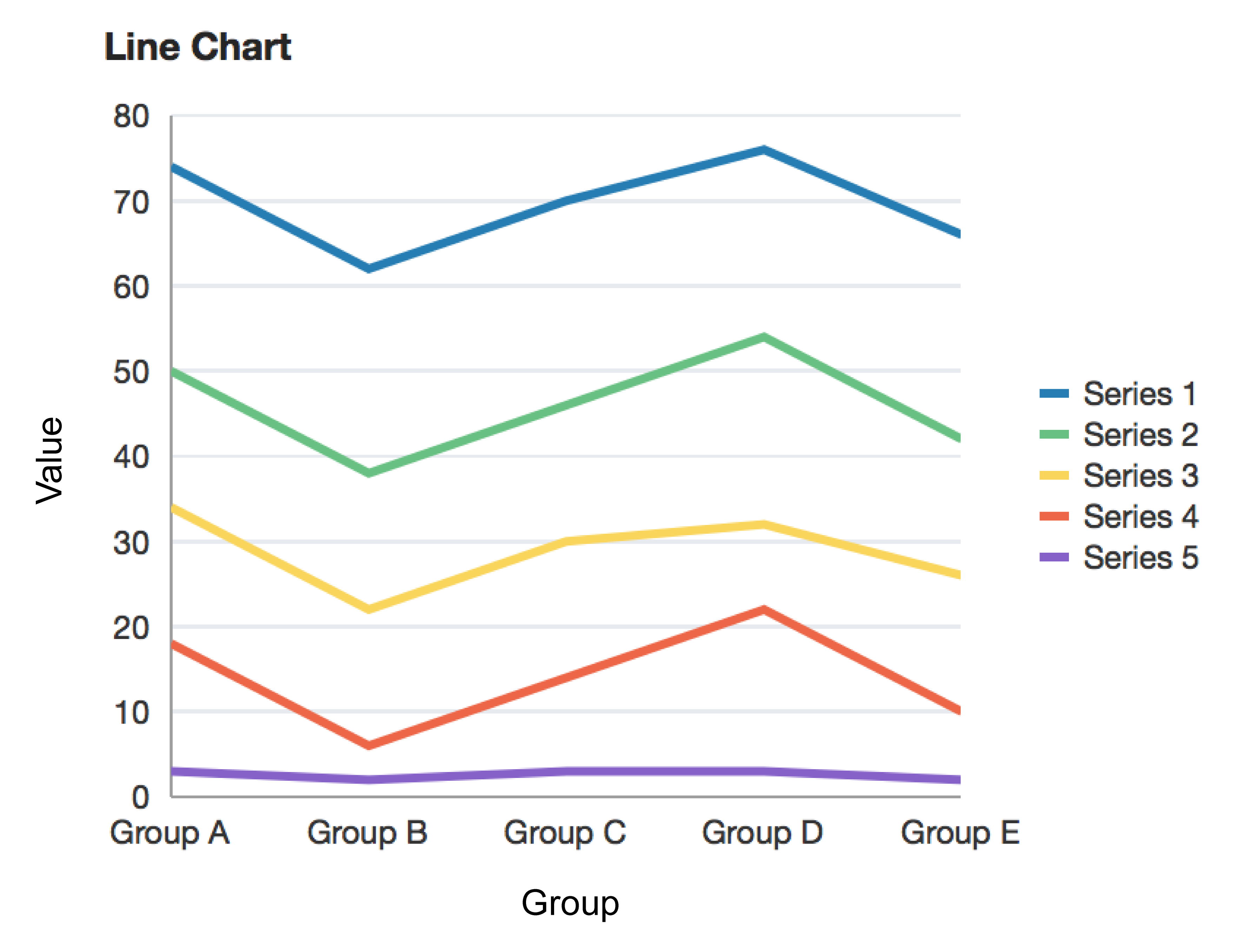
An example of a line chart. Reprinted from “lineChart”, in Oracle, 2014. Retrieved from https://docs.oracle.com/middleware/1213/adf/tag-reference-dvt/tagdoc/dvt_lineChart.html
A line chart displays information as a series of data points, with each point connected by straight line segments.
Pie Chart#
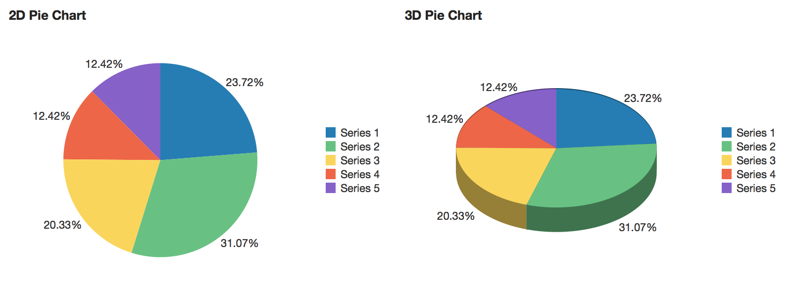
An example of a 2D and 3D pie chart. Reprinted from “pieChart”, in Oracle, 2014. Retrieved from https://docs.oracle.com/middleware/1213/adf/tag-reference-dvt/tagdoc/dvt_pieChart.html
A pie chart displays values as percentages of a whole, where each value is shown as a sector of a circular area.
Visualizations that show a whole divided into slices to illustrate numerical proportions are known as statistical graphics.
Box Plot#
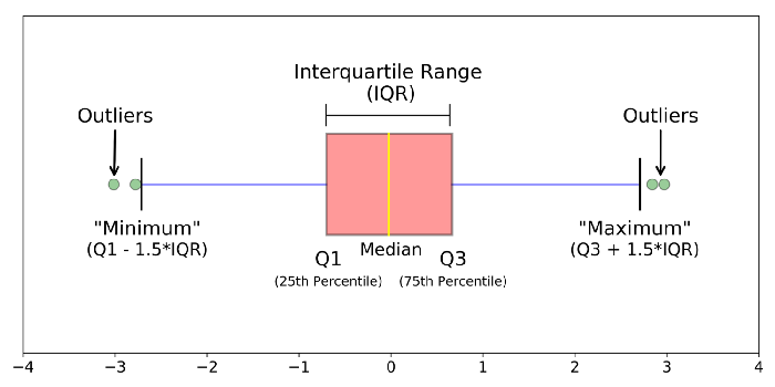
Reprinted from “Understanding Boxplots”, by Galarnyk, M. 2018, September 11. Retrieved from https://towardsdatascience.com/understanding-boxplots-5e2df7bcbd51
A box plot is a “standardized way of displaying the distribution of data based on a five number summary (‘minimum’, first quartile (Q1), median, third quartile (Q3), and ‘maximum’)” (Galarnyk, 2018, para 1). Box plots are used to obtain information about outliers and their values, as well as whether the data is symmetrical, and whether it is skewed.
Read more https://towardsdatascience.com/understanding-boxplots-5e2df7bcbd51.
Bubble Chart#
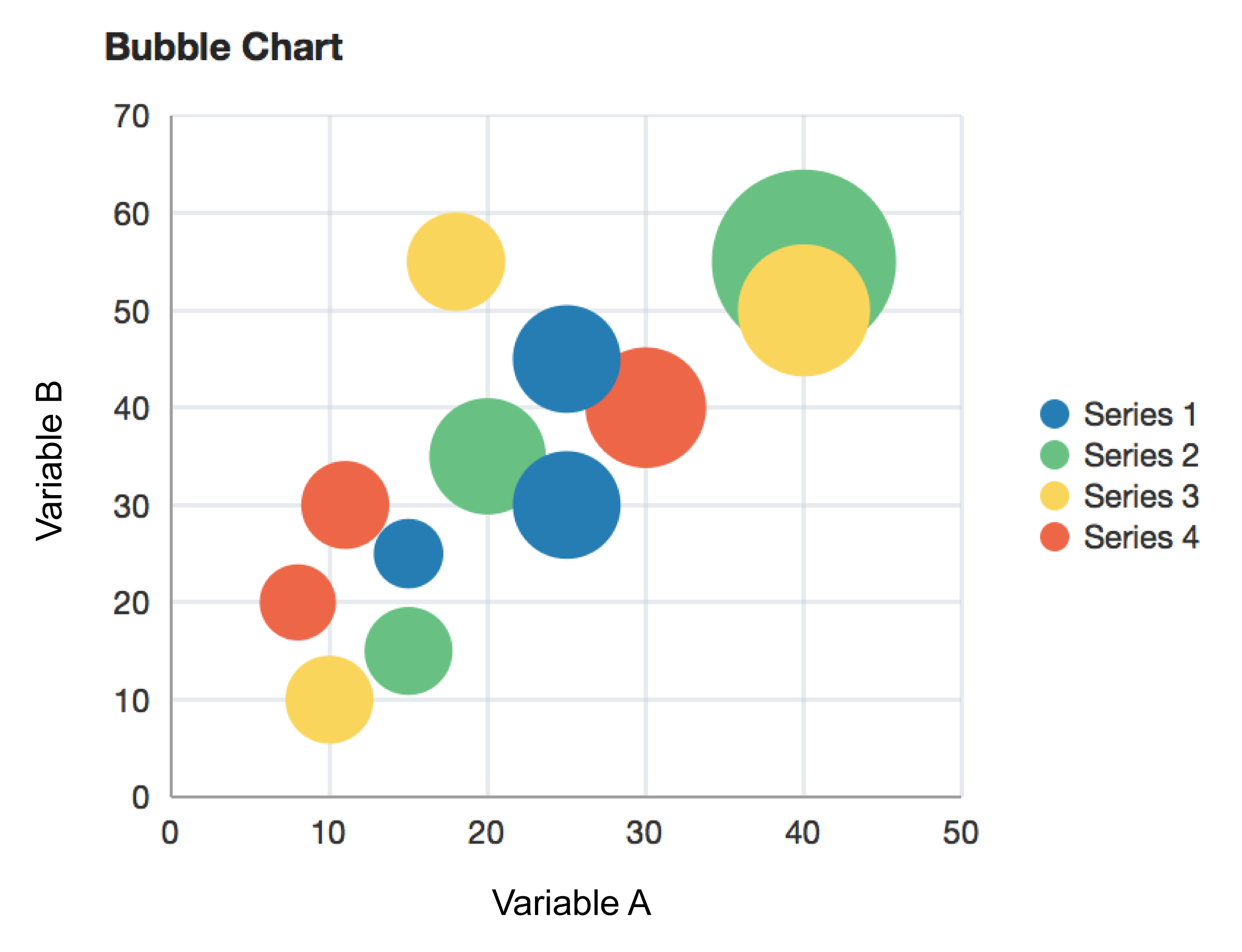
An example of a bubble chart. Reprinted from “bubbleChart”, in Oracle, 2014. Retrieved from https://docs.oracle.com/middleware/1213/adf/tag-reference-dvt/tagdoc/dvt_bubbleChart.html
A bubble chart displays three dimensions of data using different sizes and colours of circles, or bubbles.
The chart can represent up to four variables of data. The xy position in the chart represents 2 variables, the size of the circle represents a 3rd variable, and the colour represents a 4th.
Marked Up Map#
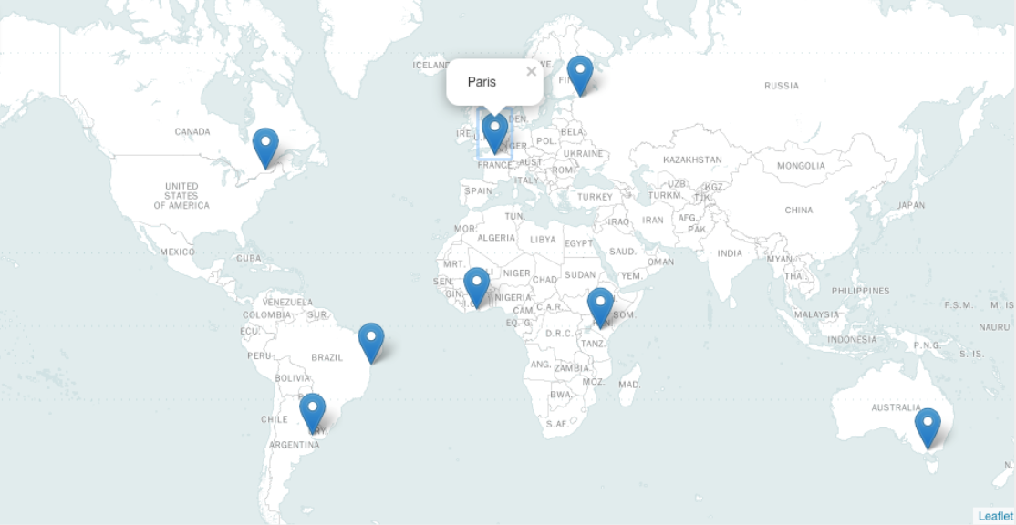
A marked-up map is a geospatial graphic that uses latitude and longitude coordinates and marks them using pins.
This kind of visualization is useful for showing geographic distribution of places, objects, or events.
🎥 Watch#
This 10-minute video provides a high-level overview of different kinds of data visualizations and how they can be used.
from IPython.display import YouTubeVideo
YouTubeVideo('hEWY6kkBdpo')
Creating simple data visualizations with Python#
This section contains tutorials! Get the most out of them by opening a Jupyter notebook in another window and following along. Code snippets provided in the course can be pasted directly into your Jupyter notebook. Review Module 2, Unit 5 for a refresher on creating and opening Jupyter notebooks in Callysto.
Data visualizations can be created in a Jupyter notebook using Python code. Let’s try a few of them now with this simple data set.
Variable 1 |
Variable 2 |
|---|---|
1 |
2 |
2 |
4 |
3 |
8 |
4 |
16 |
Before starting any of the tutorials, run the code below to add this data to your Jupyter notebook.
Var1 = [1,2,3,4]
Var2 = [2,4,8,16]
You might recall from the last module that a collection of numbers separated by commas and surrounded by square brackets is a list
These lines of code are actually creating two lists, Var1 and Var2, which each contain four numbers.
🏁 Tutorial: Bar Chart#
Step 1
In a new code cell, run the code below to call the bar plot tool from the Python library Matplotlib.
This library is already included within the Callysto Hub, so it doesn’t need to be installed.
from matplotlib.pyplot import bar
Step 2
Use the bar function to create a simple chart from the two lists you created earlier.
bar(Var1,Var2);
The output should look like this:
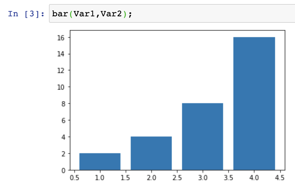
Bar chart representation of function y(x) = 2^x, where x = 1,2,3,4. The bar chart representation might lead us to interpret 4 as the most frequent value (appearing 16 times), followed by 3 (appearing 8 times), followed by 2 (appearing 4 times), followed by 1 (appearing twice).
Notice that the Var1 values are mapped along the x axis and the Var2 values are mapped along the y axis. This is because of the order we used to pass them to the bar function.
Now try running the command again with the lists names swapped to see what happens!
bar(Var2,Var1);
🏁 Tutorial : Scatter plot#
Step 1
In a new code cell, run the code below to call the scatter plot tool from the Matplotlib library.
from matplotlib.pyplot import scatter
Step 2
Use the scatter function to create a simple graph from the two lists you created earlier.
scatter(Var1,Var2);
The output should look like this:
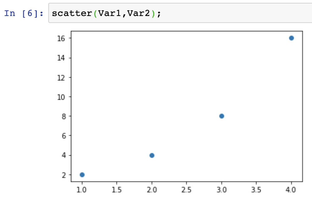
Scatter plot representation of function y(x) = 2^x, where x = 1,2,3,4. The scatter plot shows us the relationship between an independent variable (x=1,2,3,4) and a dependent variable y showing the value of 2 when we raise it to the power of x. Respectively, y = 2,4,8,16.
🏁 Actvity#
Line Chart#
The steps to create a line graph using the plot function are very similar to the steps in the last two tutorials.
In your Jupyter notebook, try creating a line plot from our Var1 and Var2 lists.
from matplotlib.pyplot import plot
plot(Var1,Var2);
The output should look like this:
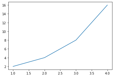
Line chart representation of function y(x) = 2^x, where x = 1,2,3,4. Like the scatter plot, the line chart shows us the
🏁 Tutorial: Pie Chart#
Pie charts are a little different, as they only require a single set of values. The values represent how much of the pie is allocated to each segment.
Try it now:
from matplotlib.pyplot import pie
pie(Var1);
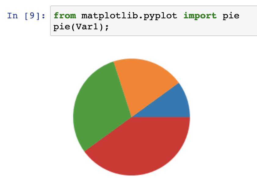
Pie chart representation of values x=1,2,3,4. These values are stored in the variable ‘Var1’. Using matplotlib’s pyplot module, we can access a function called ‘pie’ - that allows us to showcase the percentage breakdown of a set of values.
🏁 Tutorial: Box Plot#
Box plots are a little more complex than the other visualizations we’ve created so far. They display a range of data points using a box to show the central range, and “whiskers” for the minimum and maximum values.
Because they represent the variability or dispersion of data, we’ll need a bigger data set than our simple Var1 and Var2 lists to create a good example.
In your Jupyter notebook, run the code below to create two new lists, TeamA and TeamB. The numbers in these lists represent the scores for each team, playing in a series of games of soccer.
TeamA = [2,1,2,3,4,4,4,4,4,4,1,2,4,5,6,4,2,0]
TeamB = [1,1,1,3,4,1,4,1,2,4,1,2,4,5,6,4,2,0]
Now let’s create some box plots from our data.
Step 1
Run the code below to call the boxplot tool from the Matplotlib library.
from matplotlib.pyplot import boxplot
Step 2
Now we’ll use the boxplot command we’ve imported to create two box plots, one for each list of data. To help us see which is which, we’ll also specify labels for each one.
boxplot([TeamA,TeamB],labels=["Team A","Team B"]);
The output should look like this:
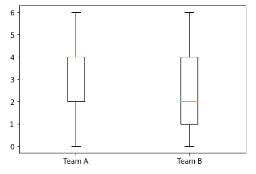
We can see that the median score in Team A is higher than in Team B, as represented by the orange/yellow horizontal bar. We can also see that the values range from 0 to 6 for both teams.
From this box plot, we can see immediately that the min and max scores for each team are zero and six. The median for Team A is 4 while the median for team B is 2, as indicated by the orange line in the boxes. The first and third quartiles for each team are also indicated by the frame of the boxes.
Explore#
This Jupyter notebook provides a walkthrough of the tutorials in this unit and can be shared with students or colleagues. Come back to this course after interacting with the notebook.
Conclusion#
In this unit, we learned about some simple types of data visualizations, how they are categorized, and how we can generate them in Jupyter notebooks using Python commands.
The next unit is optional and explores some more advanced types of visualizations, although tutorials are not included. If you prefer, you can skip ahead to Unit 2 which explores how to select a visualization type that fits our data.

