

![]()
Creating, Labelling, and Interpreting Line Graphs
Line graphs are useful for visualizing (seeing) patterns in data. Wikipedia defines them as “a type of chart which displays information as a series of data points called ‘markers’ connected by straight line segments.”
We can make line graphs using Python. We need to import the “matplotlib” library, tell it what data to graph, and maybe add some labels.
To import the matplotlib library, select the cell below this one and click the Run button on the toolbar. Make sure you do this before trying to run code in other cells in this notebook.
import matplotlib.pyplot as plt
%matplotlib inline
print('Successfully imported matplotlib')
Successfully imported matplotlib
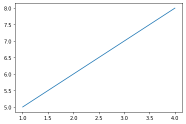
On a graph, the horizontal axis is called the x-axis, and the vertical axis is the y-axis. Let’s put the x values in a list called x and the y values in a list called y. Select the cell below this one and click the Run button on the toolbar to display a graph.
x = [1, 2, 3, 4]
y = [5, 6, 7, 8]
plt.plot(x, y)
plt.show()
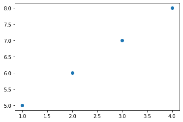
We can also create a scatter plot by changing plt.plot() to plt.scatter().
x = [1, 2, 3, 4]
y = [5, 6, 7, 8]
plt.scatter(x, y)
plt.show()
Next try making your own graph using the code below and the data from this chart:
x |
y |
|---|---|
1 |
1 |
2 |
4 |
3 |
9 |
4 |
16 |
Remember to include commas between the numbers in each list.
# Lines that begin with a # symbol will be ignored by the computer.
# Cells that contain a ✏️ are ones you should edit.
x = []
y = []
plt.scatter(x, y)
plt.show()

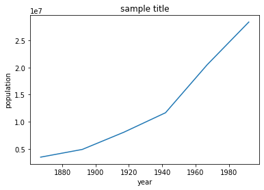
Now let’s try some real-world data, the population of Canada over time. Population will go on the y-axis and time on the x-axis. Add the data from this table to the next code cell, and Run the cell.
Year |
Population of Canada |
|---|---|
1867 |
3463000 |
1892 |
4883000 |
1917 |
8060000 |
1942 |
11654000 |
1967 |
20500000 |
1992 |
28377000 |
#✏️
population = []
year = []
plt.plot(year, population)
plt.show()
We can see that the line gets steeper, meaning that the rate of population growth was increasing.
Now let’s add some labels to that graph so other people will know what we are displaying.
In the code cell below, change the line plt.title() to plt.title('Population of Canada Over Time')
populations = [3463000, 4883000, 8060000, 11654000, 20500000, 28377000]
years = [1867, 1892, 1917, 1942, 1967, 1992]
plt.plot(years, populations)
plt.title("sample title")
plt.ylabel('population')
plt.xlabel('year')
plt.show()
Now it’s your turn to make a line graph of some data. Graph the number of hours of daylight in Edmonton (or your closest city) per day in December using data from https://www.nrc-cnrc.gc.ca/eng/services/sunrise/advanced.html. Copy and paste each of the values into the daylight_hours list, with commas between the numbers.
Since there are 31 days in December, we will have the code make up a dates list.
#✏️ Paste in the correct daylight hours values from https://www.nrc-cnrc.gc.ca/eng/services/sunrise/advanced.html
daylight_hours = []

dates = list(range(1, 32))
#✏️ Uncomment the line below
#plt.plot(dates, daylight_hours)
plt.title('Daylight Hours in Edmonton per Day in December')
plt.ylabel('hours of daylight')
plt.xlabel('date in December)')
plt.show()
# Run this cell to display the graph.
# If there's an error, make sure you have 31 daylight_hours values, and had run the first cell in this notebook.
What observations can you make about how the hours of daylight per day changes throughout December?
Double-click on the next cell to edit it and add your answer.
✏️I observe that
What other data might you want to graph using a line graph? Check out what data are available on Open Data sites such as https://open.canada.ca/en/open-data or https://open.alberta.ca/opendata.
✏️I would like to create a graph of
If you find an interesting data set, create your own line graph below.
x = []
y = []

plt.plot(x, y)
plt.title('')
plt.ylabel('')
plt.xlabel('')
plt.show()

Interpreting Graphs
Here is a graph of average daytime high temperature in Edmonton, Alberta by month (using data from NOAA).
y = [-7, -3, 2, 11, 18, 21, 23, 22, 17, 11, 1, -5]
x = list(range(1,13))

plt.plot(x, y)
plt.title('Average Temperature in Edmonton by Month')
plt.ylabel('Temperature (°C)')
plt.xlabel('Month')
plt.xlim(1,12)
plt.grid(True)
plt.show()
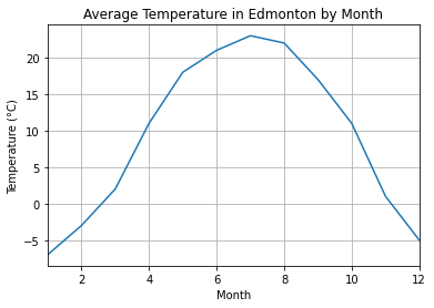
Based on the graph above, which month seems to be the warmest?
✏️The warmest month seems to be
Based on the graph, which month seems to be the coldest?
✏️The coldest month seems to be
Here’s another graph with data for Edmonton, Alberta in blue and data for Honolulu, Hawaii in red.
averageHighEdmonton = [-7, -3, 2, 11, 18, 21, 23, 22, 17, 11, 1, -5]
averageHighHonolulu = [27, 27, 28, 28, 29, 30, 31, 31, 31, 30, 29, 28]
x = list(range(1,13))
plt.plot(x, averageHighEdmonton, color='blue')
plt.plot(x, averageHighHonolulu, color='red')
plt.title('Average Temperature in Edmonton and Honolulu by Month')
plt.ylabel('Temperature (°C)')
plt.xlabel('Month')
plt.xlim(1,12)
plt.grid(True)
plt.show()
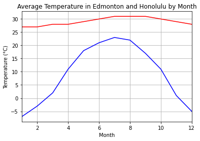
What two differences do you notice between the two lines?
✏️
What similarity do you notice between the lines?
✏️I notice that
How do you think this graph would look if we used data from Sydney, NSW, Australia?
You can search for this information to get both numbers and graphs.
✏️I think that for Sydney, NSW, Australia
How do you think this graph would look if we used data from the North Pole?
✏️I think that for the North Pole
The World Health Organization has published growth charts of children in Canada for boys and girls. From the appropriate graph, figure out approximately which percentile you are in for your age and height.
✏️I am in the