

![]()
from IPython.display import HTML
hide_me = ''
HTML('''<script>
code_show=true;
function code_toggle() {
  if (code_show) {
    $('div.input').each(function(id) {
      el = $(this).find('.cm-variable:first');
      if (id == 0 || el.text() == 'hide_me') {
        $(this).hide();
      }
    });
    $('div.output_prompt').css('opacity', 0);
  } else {
    $('div.input').each(function(id) {
      $(this).show();
    });
    $('div.output_prompt').css('opacity', 1);
  }
  code_show = !code_show
}
$( document ).ready(code_toggle);
</script>
<form action="javascript:code_toggle()"><input style="opacity:1" type="submit" value="Click here to toggle on/off the raw code."></form>''')
hide_me

from ipywidgets import interact
import ipywidgets as widgets
import IPython

import matplotlib.pyplot as plt
import numpy as np
import math

import plotly as py
import plotly.graph_objs as go

import pylab

from IPython.display import Image, HTML, YouTubeVideo
Data Representation in Graphs
Grade 8 curriculum
Data plays an ever-increasing role in our lives. Like it or not, we are faced with numerical information every day, and we use it to make decisions. Should I be glad that 9 out of 10 dentists recommend my toothpaste? What about the 10th? A new study says that going for a run at 5 a.m. every morning reduces my risk of catching some terrible disease by 15%. Is it worth getting out of bed?
It’s often hard to find meaning in data if it’s just a bunch of numbers on a page, so we make that easier by using graphs. Graphs take data and turn them into pictures—bars, lines, circles, and more. But not all graphs are created equal; some do their jobs better than others. A good graph is a perfect tool for understanding a problem. A bad graph can be confusing, or in some cases, intentionally misleading.
Graphs are used every day by news media, politicians, and scientists to convey information. Some use them well; some do not. In this notebook, we’ll explore good and bad examples of graphs. By working through the examples and exercises in this notebook, you’ll learn:
how to decide which type of graph is best for a given set of data;
how to identify flawed or misleading graphs;
how some of those flaws can be corrected; and
most importantly, how to read a graph and apply its meaning to your everyday life.
Many of the examples of bad graphs you’ll find below are from the media (and one source in particular). This notebook isn’t trying to criticize these sources. They just happen to have given us a lot of examples to choose from.
What makes a good graph?
First and most importantly, a graph should allow a reader, at a glance, to understand the information it’s meant to convey. A good graph is like a good movie scene; if it’s set up well, you can tell exactly what you’re supposed to know. Some basic parts of a successful graph are:
A title
Proper labels
Axes that start at zero (if numerical)
Percentages that add to 100%
Easy to read
Use of colours, as long as they are meaningful and not just for show
By the way: axes (ACK-sees) are the reference lines on a graph. They’re where you find the names of the categories (usually at the bottom) and the number scale (usually on the left). One of these lines is called an axis (ACK-sis).
For a quick overview of different types of graphs and simple examples, you might find this Math Is Fun article useful. We’ll look at some of these kinds of graphs below. You’ll notice many of them are eye-catching, and they also convey information really well.
One of the places you’ll find a lot of graphs is in political coverage. The media (and many of their readers/viewers) love a good “horse race”. For example, this CBC federal poll tracking article uses almost every type of graph you’ll find in this notebook.
We’ll also explore how a graph can be used to mislead someone. We hope this notebook will help you learn how to avoid using misleading graphs, as well as how to avoid being misled yourself.
There’s even a wall of shame with some of the worst graphs and charts!
Let’s look at bar graphs
What is a bar graph?
A bar graph is a graph where data is separated into categories, and those categories are shown as bars with different heights. It’s a very useful graph, but it can also easily be misleading.

from Math is Fun
When are bar graphs good to use?
Bar graphs can be used in many ways, but they usually show one piece of information collected from many groups or categories. For example, they might show the number of hours worked by people in different age groups, or how many grey shirts each girl in a class owns.
What are some ways to misuse bar graphs?
Make the scale on the graph start above zero. This makes small differences between bars look much bigger than they really are.
Change the width of the bars to make one category look more important. This gives one bar more area, which looks like more data.
Remove the space between the bars (that’s a histogram). Histograms are used for a different kind of data set, and so they are read in a different way.
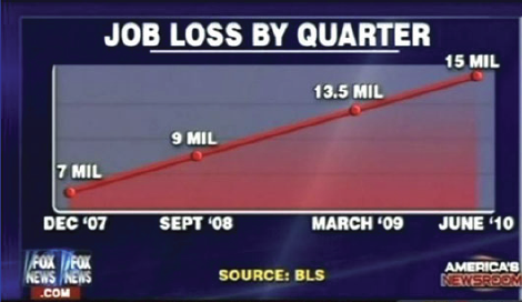
Here’s an example of a poorly made bar graph. It shows the total welfare (support money) received by people in the US from 2009 to 2011. Each year is divided into 4 three-month pieces called quarters.
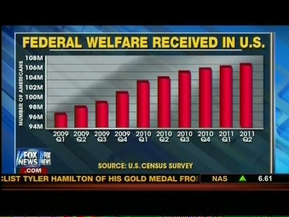
from MediaMatters
What makes this a bad bar graph?
Their scale starts at 94 million insead of 0.
The bars are in 3D, making their values harder to read.
Their y-axis has 8 labels, but there are 10 levels on the graph (including the top and bottom).
Whoever made this graph probably wanted the viewer to think welfare in the US is rising faster than it really is. Now, let’s ask ourselves:
What can we change to make this a good graph?
How does it look after we make these changes?
Why might the original creators not want to use our new graph?
One way we can improve this graph is by changing where its scale starts. Play with the slider below to see how the graph looks with different scales.
Slide the slider below to change the starting point of the \(y\)-axis. The initial position corresponds to the graph in the image above. As you move the slider to the left, the starting point for the \(y\)-axis is reduced to zero.
Warning: This graph is slow to respond, please be patient with it.
hide_me

columns = ['09-Q1', '09-Q2', '09-Q3', '09-Q4', '10-Q1', '10-Q2','10-Q3', '10-Q4', '11-Q1', '11-Q2']
#fig, ax = plt.subplots()
def plot(yaxis=94):
    y = [97, 98, 99, 101, 104, 105, 106, 107, 107.5, 108]
    x = np.arange(len(y))
    fig, ax = plt.subplots(figsize=(10,4))
    ax.bar(x, y, width=0.5)
    ax.set_xticks(x)
    ax.set_xticklabels(columns)
    ax.set_ylim((yaxis,110))
    ax.set_title("Federal Welfare Received in the US")

interact(plot, yaxis=(0,90), continuous_update = True, wait = False)
#plt.show()
Let’s look at pictographs
What is a pictograph?
A pictograph is a way to show data using images, where each image represents a certain number of things that are being measured. They look a lot like bar graphs and they can be horizontal or vertical too.

from Math is Fun
Why do people like to use pictographs?
The main reason is because the pictures offer something for readers to connect with other than just a row of coloured bars.
Also, pictographs often work best to show data with small numbers. If everything can be easily expressed with a simple scale like the one above, then a pictograph might be the right choice to represent the data.
When are pictographs not a good choice?
In the example above, what if Sam played 46 games instead of 45? This pictogram counts games in steps of 5, so numbers in between these steps might be hard or impossible to show.
A reader might also make a connection with a pictograph that wasn’t intended. Let’s show this with an example.
On Halloween, Shayna and Michael went trick-or-treating. Shayna got 18 pieces of candy, and Michael got 36. Their totals are shown in this pictograph:
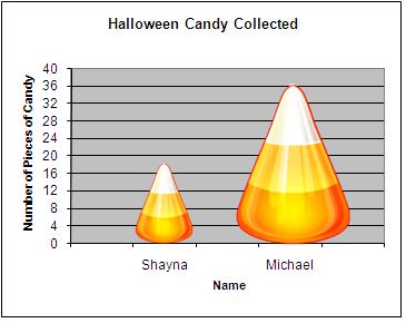
from teachersinstitute.yale.edu
At first, is looks like a fine way to show how much candy each child got. The heights of the candy corn pieces are being used to mark the two amounts. But as a viewer, we don’t see just the height—we also see the width. Not only is the second candy corn twice as high, it’s also twice as wide, giving it four times the area as the first candy corn. This makes it look like Michael got 4 times as much candy as Shayna, even though he only got twice as much.
Click the “Display” button below to show a better, more accurate way to represent the same data:
hide_me

pic = Image('images/CandyCornGraph.png')
clicker = widgets.Checkbox(value=False, description='Display', disabled=False)

def checking(a):
    if clicker.value == True:
        IPython.display.display(pic)
    else:
        IPython.display.clear_output()
        IPython.display.display(clicker)

IPython.display.display(clicker)
clicker.observe(checking, 'value')
Let’s look at line graphs
What is a line graph?
A line graph is a way to show how the measurement of one value responds to changes in another, like how something may change over time. In fact, time is one of the most common variables with a line graph.

from Math is Fun
Why are line graphs useful?
They show a moving trend with a line that’s easy to follow, instead of just dots on a graph. They work best when the trend involves the change of one variable (jobs, temperature, debt) with respect to another (usually time).
In some cases it can also be useful to plot multiple lines on one graph, usually with different colours to help tell them apart. For example, one might plot polling results for different political parties over time, as with this graph from the CBC:
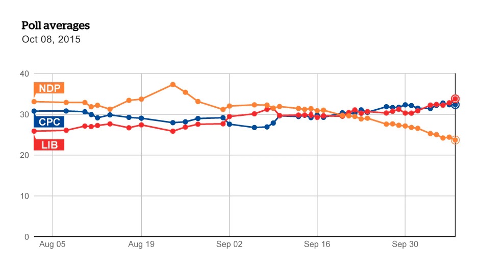
from cbc.ca
How can line graphs go wrong?
A common error with line graphs is unlabelled axes. A graph might show a line that slopes upwards, but without labels, we wouldn’t know what is growing or how fast. Also, line graphs can trick us into thinking a trend is linear by spacing out the ticks unevenly on one axis, so that the data points neatly line up. Like this example:

from Online Stat Book
hide_me

fix = widgets.SelectionSlider(options=['original', 'fixed'], value ='original', description='Slide to fix',
    continuous_update=True, orientation='horizontal',)

def fixing(a):
    if fix.value == 'fixed':
        IPython.display.clear_output()
        IPython.display.display(fix)
        f, ax1 = plt.subplots(1,1,figsize=(10,5))
        ax1.set_title("Job Loss by Quarter")
        ax1.set_xlabel('Months from November 07',fontsize=15)
        ax1.set_ylabel("Jobs Lost in Millions",color='b',fontsize=15)
        x1 = [1, 10, 16, 29]
        y1 = [7,9,13.5,15]
        ax1.plot(x1, y1,"bo-")
        plt.legend()
        plt.show()
    else:
        IPython.display.clear_output()
        IPython.display.display(fix)
        f, ax1 = plt.subplots(1,1,figsize=(10,5))
        ax1.set_title("Job Loss by Quarter")
        ax1.set_xlabel('Months from November 07',fontsize=15)
        ax1.set_ylabel("Jobs Lost in Millions",color='b',fontsize=15)
        x1 = [0,7,23,29]
        y1 = [7,9,13.5,15]
        ax1.plot(x1, y1,"bo-")
        plt.legend()
        plt.show()

IPython.display.display(fix)
fix.observe(fixing, 'value')

IPython.display.clear_output()
IPython.display.display(fix)
f, ax1 = plt.subplots(1,1,figsize=(10,5))
ax1.set_title("Job Loss by Quarter")
ax1.set_xlabel('Months from November 07',fontsize=15)
ax1.set_ylabel("Jobs Lost in Millions",color='b',fontsize=15)
x1 = [0,7,23,29]
y1 = [7,9,13.5,15]
ax1.plot(x1, y1,"bo-")
plt.legend()
plt.show()
Let’s look at circle graphs
What is a circle graph?
Also known as a pie chart, a circle graph is used to show how a total is split into different groups. The whole pie represents the total, and each slice of the pie represents a different group. Each slice gets as much of the pie as its group has of the total—the bigger the slice, the more of the total that group represents.

from Math is Fun
Why are circle graphs useful?
They make it easy to compare group sizes; if there’s a biggest or smallest group, that’s easy to see, since group sizes are shown as pieces of a whole.
Why might people not use circle graphs?
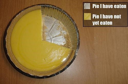
To be displayed as a circle graph, data must be converted into percentages of the total, then into slices of a circle, which is more work than other graphs need. Plus, it’s easy to mess up if the data are not converted properly (or at all). Circle graphs are also hard to draw accurately on paper, since you need a protractor to ensure your angles are correct. Some people might even say that any time a circle graph would do, a bar graph would do better, and that the pie chart below is the only acceptable one.
from Flowing Data
What was wrong with these graphs?
Mislabeled/Missing axes
Plotted wrong
Hard to read
Numbers don’t add to 100%
Wrong data shown
The video below goes through several examples of bad/misleading graphs (some of them shown in this notebook) and why they are not good representations of the original data.
hide_me

YouTubeVideo('1F7gm_BG0iQ')
Practice Questions
Question 1
A group of kids was asked what they do first when they get home from school. The data are shown in the table below. Data source here
Activity |
Percent |
|---|---|
Eat |
27% |
Personal Care |
19% |
Watch TV |
15% |
Study |
13% |
Play |
9% |
Other |
17% |
hide_me

answer = widgets.RadioButtons(options=['','circle graph', 'line graph', 'bar graph', 'pictograph'],
                              value='', description='Answer:')
labels = ['Eat', 'Personal Care', 'Watch TV', 'Study', 'Play', 'Other']
data = [0.27, 0.19, 0.15, 0.13, 0.09, 0.17]

def display():
    print('What would be the best graph to display this set of data?')
    IPython.display.display(answer)

def check(a):
    IPython.display.clear_output(wait=False)
    display()
    if answer.value == 'circle graph':
        print("Correct! Circle graphs are used for percentages.")
        print("Let's see this data in a circle graph.")
        patches, texts = plt.pie(data, labels=labels)
        plt.axis('equal')
        plt.tight_layout()
        plt.show()
    else:
        if answer.value == 'bar graph':
            print("A Bar graph would work, but there's a better option. Try again.")
        else:
            if answer.value == 'line graph':
                print("Line graphs are good for change over time, not percentages. Try again.")
            else:
                print("A pictograph would work if the data was in amounts instead of percentages. Try again.")

display()
answer.observe(check, 'value')
Question 2
A group of kids was asked how much time they spend doing different activities after school. The data are shown in the table below. Data source here
Activity |
Time spent (minutes) |
|---|---|
Reading |
30 |
Chores |
30 |
Watch TV |
100 |
Study |
60 |
Play |
74 |
Sports |
60 |
hide_me

answer2 = widgets.RadioButtons(options=['','circle graph', 'line graph', 'bar graph', 'pictograph'],
                              value='', description='Answer:')
labels2 = ['Reading', 'Chores', 'Watch TV', 'Study', 'Play', 'Sports']
data2 = [30, 30, 100, 60, 74, 60]
x = np.arange(len(data2))

def display2():
    print('What would be the best graph to display this set of data?')
    IPython.display.display(answer2)

def check(a):
    IPython.display.clear_output(wait=False)
    display2()
    if answer2.value == 'circle graph':
        print("A circle graph is used for percentages. Try again.")
    else:
        if answer2.value == 'bar graph':
            print("Correct! A bar graph shows the relation between both parameters in an easy to read format.")
            print("Let's see what that looks like.")
            plt.bar(x, data2, width = .3)
            plt.xticks(x, labels2)
            plt.ylabel('Time in Minutes')
            plt.title('Time Spent on Afterschool Activities')
            plt.show()
        else:
            if answer2.value == 'line graph':
                print("Line graphs are good for change over time. Try again.")
            else:
                print("A pictograph would work, but there's a better option to be more accurate. Try again.")

display2()
answer2.observe(check, 'value')
Now that we have seen many examples of both good and bad graphs, let’s look at the worst graphs in science literature and try to figure out why each graph is on the list.
(You can click on a graph to make it bigger. See if you can point out the flaws in these graphs on your own, then click the “Discussion” links to learn what’s wrong with each graph and why it made it to the list!)
Even top academic institutions sometimes produce images that, while they might look impressive, do very little to help us understand the numbers involved in an issue. Try to figure out what’s wrong with these infographics from Princeton on your own.
What have we learned?
In this notebook, we have learned:
Graphs are great at conveying numerical information
Not all types of graphs are created equal
Graphs can be manipulated to be misleading
How to identify misleading parts of graphs
There are steps to create truthful graphs
With this knowledge, you are able to be more informed when you see any kind of data displayed in a graph. You are also able to create truthful graphs of your own. Keep trying to identify good and bad graphs in your every day life.